5 Reasons You Should Add a Blog Link in Your Nav Bar
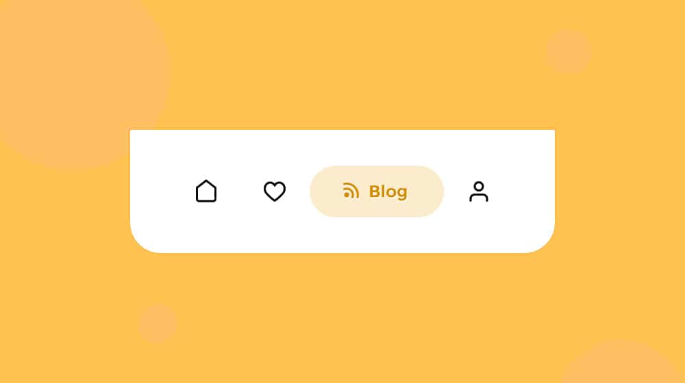
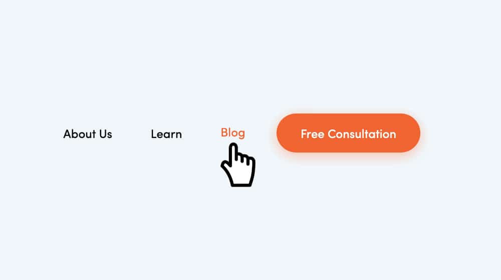
The navigation bar is a staple of modern web design. Whether it's on your homepage, stretched across the top of your blog, or lurking above your storefront, it's a key piece of navigation for your entire site.
Navigation bars used to be a lot more varied around the web. A couple decades ago, you'd have people creating sliding drop-down bars along the right-hand side of the page. You'd have people making six-layer-deep nested navigation bars. Hell, some people even made their site navigation in Flash to make use of fancy animations.
These days, two things have put pressure on the nav bar to standardize it. The first is Google. Google likes to see a navigation bar, because it means they can use it to access all of the major sections of your site for indexing purposes.
The second is simply societal pressure. All of those fancy, varied navigation bars were cool, but the internet isn't a place for people to experience novel and cool things, not anymore. These days, it's all about getting the information you want as quickly as you can. Users, when confronted with a navigation bar in a strange format, are just as likely to get confused and leave rather than try to figure it out.
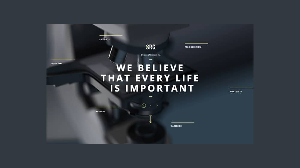
Yes, sadly, the time for interesting and novel web design has passed, unless it's part of an overarching project.
These days, many websites start with a standard navigation bar. The "standard" has about five links on it, leading to major sections you would want to see as a reader. These are: Home, About, Services/Store, News/Blog, and Contact. The specific choice and phrasing, of course, depends on your branding.
My site, this very site you're reading, only has four links at the top of the homepage. Service, Company, Contact, and Blog. The fifth, the "home", is the logo. This, too, is fast becoming standard.
In fact, if you want to do a bit of an experiment, spend a day on a project. Every website you visit, look for the company logo in the upper left, and see if it's a link that brings you to the homepage for that site. I would venture to guess that the vast majority of them do.
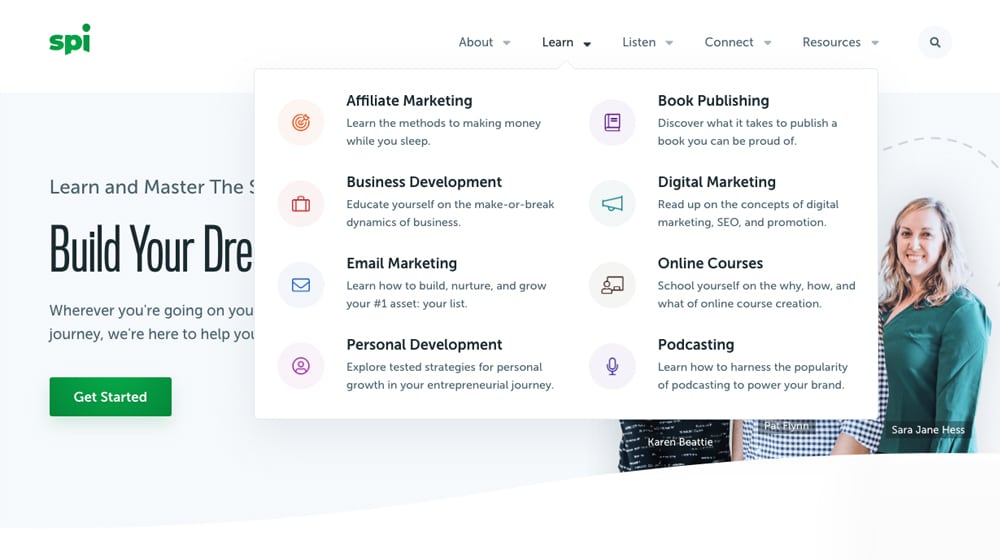
Of course, the "traditional" five-link navigation bar isn't always enough for everyone. Some sites focus on putting more call to action-style buttons up top. Smart Passive Income, for example, has: The homepage linked logo, an About page, a Learn page that links to various blog sections, a Listen link that leads to their podcasts, a Connect page with information on webinars, workshops, and other content, and a Resources page with information about the courses, tools, and books they offer.
The specific choice of the links you want in your navigation bar can vary depending on the focus of your brand. In my opinion, though, you should always have a link to your blog in the top bar. Why, though? Here are my five reasons.
 30 Second Summary
You need five important links in your top navigation bar: Home, About, Services/Store, News/Blog and Contact. You can make your logo the home button - most sites do this now. You'll find your blog works best as a main nav link rather than in a dropdown menu because it helps you get better SEO value, makes content easier to find, keeps people on your site longer, builds trust with readers and helps you connect with customers. The specific link names can change based on your brand, but having your blog easily visible is important.
Reason #1: It Adds SEO Value to Your Blog
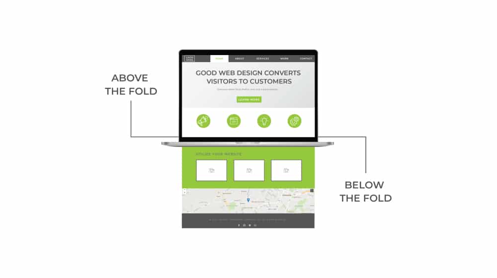
If you were to take your website's homepage, top to bottom, and print it out on a long sheet of paper, you could take a highlighter and circle areas that are considered more important. Among those areas are the top bar navigation, the top-of-page call to action, and whatever the headline is for the page the user is on. In other words, the stuff at the top of the page.
This is the content that loads before everything else. This is the content users see before they see anyting else. On a lot of pages, users have to scroll down before they can even begin reading content, simply due to the size of the modern viewports for desktops, laptops, and mobile devices.
It's not just a user perception thing, either. Content at the top of the page, above the fold, is considered the most important content on a website by Google. Everything that you link to on the top of the site is given a higher value as a top-level link in Google's index.
Compare this to leaving your blog link to your footer, or a sub-menu of a different kind of drop-down in your navigation bar. A sub-link is worth less than a top-level link, and a footer link is worth even less than that. Hell, there are websites that put links in their footer, while also using an infinite scroll script, so the modern user would have to scroll for hours if not days to even see the footer.
The only exception to this is when your website is a blog. You don't really need a dedicated "blog" link in your top bar navigation when the logo/homepage link is to the main index page of your blog. For example, a site like Search Engine Journal is basically just a blog. Their top bar navigation is all sub-sections of blog content, different topics with different focuses, but if you scroll down, you find that you're already on their blog, so you don't need a dedicated link to it.
Some sites don't do this, of course. Crazy Egg has a homepage that is basically just a landing page. There's no top bar navigation at all, other than their logo and the functional login/trial calls to action. Once you find their blog, though, the logo-based link doesn't take you back to their homepage, it takes you back to their blog index.
Reason #2: It Makes Your Blog Easier to Find
Remember that the attention span of the typical web user is roughly half a second. If they land on your site and they're looking for something, and they don't find anything to capture their attention right away, they're just going to leave.
Of course, putting a link that just says "blog" at the top of the page isn't necessarily the most attractive thing you can do. Sometimes you want to change it up. A "learn" link or a "read more" link or a "insider secrets" link can all work, as can giving your blog a fancy name – like the Crazy Egg "Daily Egg" name – can draw more attention.
It's all about the opportunity. Giving the user the opportunity to find your blog means that some proportion of your visitors will, in fact, click on that link. If the link doesn't exist, though, there's nothing for them to click. Any clicks at all are better than no clicks, so that's an obvious choice.
This is also one reason why you shouldn't put your blog as a sub-section in a drop-down menu, and why some people don't like drop-down menus at all. Drop-down menus specifically have issues.
- They hide the content a user might want front and center.
- Depending on how they're coded, it might be hard for Google to index the links.
- Depending on how they're displayed, it might be hard for users to use them.
If you've ever tried to use a drop-down menu where it keeps disappearing if you don't mouse over it quickly enough, or a script keeps tickling the page and causing it to collapse, you know exactly what I'm talking about here.
Drop-downs are also harder to use on mobile devices. That's why so many people these days use the "burger button" for a menu options on mobile, and use collapse-expand style nested menus instead of a janky drop-down. That is, frankly, probably the best option for websites in general now, and I won't be surprised to see more and more sites transitioning to that style of navigation on desktop platforms as well.
In any case, it's all about visibility to users here. You want your users to be able to actually see and find your blog in a convenient way, so that they can check it out on a whim, and maybe stick around.
Reason #3: It Increases Dwell Time
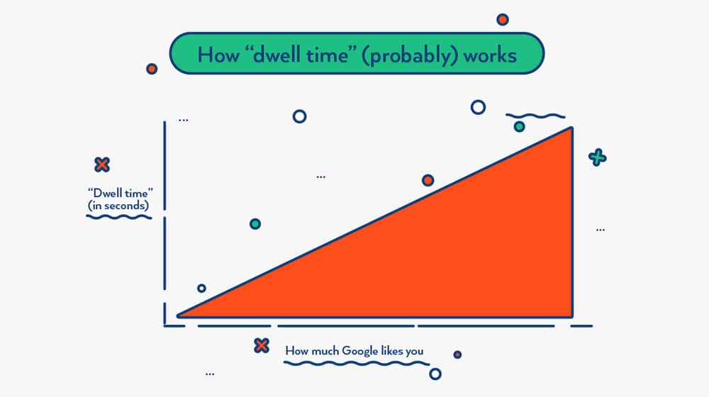
Dwell time is a metric that is involved in SEO in some way, but there's a lot of confusion about what it is and how it works. One thing we know, though, is that dwell time improves as the interest of your visitors improve.
Dwell time is literally just the measurement of the time people spend lingering on your site. If dwell time is extremely short, it's a user who bounced. If dwell time is extremely long – with no other page activity – it's likely someone who just left their computer and idled on you page.
What you want is something somewhere in between. You want a dwell time that is long enough, and includes enough other activity, like scrolling, to indicate that a user is happily spending time on your page.
Blogs are some of the best website content for dwell time, short of things like video and podcasts. Blogs get people to linger and read, while still scrolling down a page and clicking links, interacting with page elements, and potentially clicking on calls to action. Even media like video keep the user more or less stationary on the page, not clicking on anything.
It's worth noting that dwell time is not the same thing as other time-based metrics, like "Average time spent on page." Dwell time is specifically a measurement Google takes, of the time a user spends on your site before clicking back to the search results page.
If a user clicks from a search results page into your website, then they browse your website for a while, then they close their browser, Google doesn't record any kind of dwell time for the user. The user didn't dwell on your site for a while before coming back to Google, they stayed and found what they were looking for. This is a good thing! As long as the user didn't bounce, anyways.
A satisfied user is the best kind of user, and Google greatly prefers it when they can refer a user to your site and get a satisfied user out of the transaction. That is, after all, their primary motivating factor (other than the infinite money they make). Thus, dwell time is an important metric to encourage.
Is dwell time a ranking factor? Signs point to yes. It's not a primary ranking factor, but rather, it's a piece of data that is fed into the larger algorithm that produces the primary ranking factors. It's important, and it has influence on your search ranking, but perhaps not as much as other primary factors. Still, by giving users something else to do on your site, something that consumes time, you can increase dwell time.
Reason #4: It Fosters User Trust
One of the biggest modern buzzwords in SEO is the EAT score that Google gives every page. EAT is an acronym, and it stands for Expertise, Authority, and Trustworthiness. It's been part of Google's overall guiding goals for website ranking for years, but they've recently spent more time and effort nailing down exactly what it means and telling the rest of us about it.
A big benefit to running a blog on your site is to boost your EAT score. Blogs help with all three of the parts of the acronym.
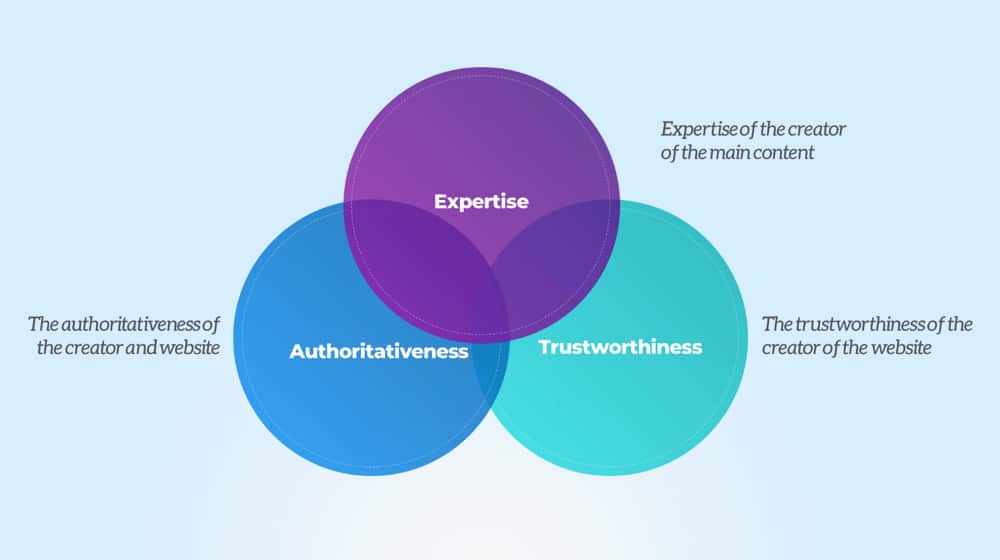
With Expertise, a blog showcases how you're an expert in the topics you're writing about. A good blog post doesn't just cover the most surface-level information on a topic, it covers the deeper, more expert-level information. You can showcase that you know what you're talking about, and that you know it well enough you can teach it to other people. Whether this is through instructive and informative articles, tutorials, or guides, it's still content you produce for your blog.
For Authority, the blog you write becomes your portfolio. The more you've written over the years, the larger your portfolio, and the more Google understands that you're really experienced in what you're talking about. You become an authority in your niche, on your topic, and Google doesn't feel bad sending people to your site when they have a related query. They know you have a position of authority and can answer their question.
Finally, for Trustworthiness, your blog is a public face for your brand. It shows a lot of little things that you probably take for granted. A blog is a lot of work, so it implicitly says to people "we're invested in this." A blog that has been going for a while indicates that your brand isn't going anywhere. A blog with names attached as authors tells people that you're not afraid to stand behind your products.
All of this together is the benefit of running a blog, so how does that tie into linking to the blog in your navigation bar? Well, by linking to your blog, you make it more visible to both users and to Google. You're telling Google especially that you're not just running the blog for SEO purposes, but because you want to help your users. If you hid the blog away where readers couldn't easily find it, that'd be another story.
Reason #5: It Helps Build Relationships
A blog helps build relationships with your readers and your customers. While we often tend to think of running a blog as a one-way flow of information, that's never quite true.
You write blog posts and post them, yes, but that information comes back to you from the other side. For example:
- People leave blog comments. Those comments can be questions, they can be statements to refute or support your points, they can be simple gratitude, but they are all ways for you to see the names, profile pictures, and opinions of your readers.
- People who read your content might share it on social media, in a way that you can engage with. People love to tag the author of a piece they share, so the author can step in with an additional comment or thanks, which makes people feel better about sharing it.
- People who read you content might have their own blogs and can link to it. When they do, you start to build up relationships within your industry. You can read the posts they linked to you from, and you can link back to them in the future. You can even strike up conversations with the people who run the other blogs, and become partners or friends.
All of this benefits from putting your blog in a prominent position on your site. Keeping it in your navigation bar is pretty much the place of honor for a site, unless your site is your blog, in which case it's already there.


 30 Second Summary


August 17, 2020
Thank you for this. I put up a small business and I am looking into creating a website and blog for SEO purposes. Do you think if I put blogs on my website, it will also increase my ranking for paid search? Hope to hear from you. Stay safe!
August 17, 2020
Hi Ann! Blogging is great for SEO, add it to your nav bar and try to avoid using a subdomain if at all possible! As far as it's affect on paid search, no, it has minimal to no effect. The only thing I can think of is some people's ads are being denied for having a site that is too "thin" on content, so a blog could be a solution to that problem by adding more pages and good content to your site. You stay safe as well, if you need anything else let me know!
August 23, 2020
I really like how SEJ did their Nav Bar. All the elements are perfectly used including typography, drop down menus, colors and animation. I am currently using a very boring Nav Bar at the moment and wanting to make an upgrade and yes I am thinking on how to make my Blog posts more eye catching to the readers. Any suggestions? Please note that I am running a gardening ecommerce website. TIA!
August 24, 2020
Hi Luke! Aside from what you can do in your CMS, most of the improvements you want to make are in HTML/CSS. If you're not super comfortable with these, you could always hire a front-end developer to help you redesign and improve these. I've had some success on sites like Freelancer.com over the years. It helps quite a bit if you have some examples to show them of what you like, so they can model your new navbar after that. Good luck!
December 22, 2020
Glad I read this, I had no idea it was so important to put your blog in your navbar. It makes sense though, if it's not important enough to make it visible, then Google might figure it's not a very important section of your site either.
December 27, 2020
Hi Yolanda!
Precisely - a lot of people hide it in their footer, but that tells search engines that if a user has to scroll to the very bottom of your site and click a little link out of dozens of others, it's probably not a very imporatnt part of your site.
Glad this helped you!
January 27, 2021
Hi James. My blog is stand alone and not on my site itself. Do you think it's time to transfer it to my website? I created my blog site way back and my website is just a year old.
January 29, 2021
Hey Barbara,
Absolutely! There are many benefits to having your blog part of the rest of your website.
The exception here would be if the content on your blog is low-quality.
This could mean it's super old content, out-dated, outsourced to lazy blog writers, not indexed on Google, no traffic, and so on.
Assuming your blog is in good shape and you have great content, it would be a smart move to consolidate the two 🙂
November 17, 2023
You convinced me!
November 18, 2023
Hey Shakar! I'm glad 🙂 I hope you see a nice bump in blog readers and traffic!