Guide: How to Grow Your Email Newsletter List with Blogging

One thing I often say is that a mailing list is one of the most important assets a business can have. Your mailing list is a list of users and potential customers who are already at least somewhat engaged with your brand. You can even keep multiple mailing lists, like one for confirmed customers and one for interested non-customers.
The primary benefit of a mailing list comes from two things. First, when you send users an email, you're reaching them when they're at their most receptive. People reading their email are primed to read email and act on the contents. People reading a blog post might not be in a situation where they can take another conversion action.
Second, an email list is an independent source of value. You need a program to manage and send out newsletters, but it's not like letting your subscription to Mailchimp expire will delete your contact list. Your list is yours, not beholden to another company. Facebook can always ban you, Google can decide your site shouldn't rank, but your email list will never betray you.
Now, you know how important a mailing list is, so you only have one hurdle left. How do you grow it?
 30 Second Summary
You can build your email list in several effective ways. You need a mix of sign-up forms on your site, which you can add with buttons, slide-in boxes and bars at the top of your pages. You'll get better results if you have something in return, like a free ebook or discount code. Your calls to action should match what your readers want. If you want to add these features, you can use plugins like Hello Bar or Thrive Leads for WordPress or apps like Socital for Shopify.
Calls to Action
A call to action is any time you make a statement, whether it's through a flashing button or a sentence in your text, asking a user to take an action. For this section, though, I'm calling anything that isn't your content a call to action - bars at the top of your site, slide-in buttons, exit intent pops, forms inside, before, or after your content; they're all calls to action.
Using a call to action is important. You would be surprised at how many typical users would be perfectly willing to sign up for your list but the thought never occurs to them. Present them with a quick and easy opportunity, though, and they'll fill it out.
Exit-intent pop-ups. The humble exit intent pop-up is that lightbox that appears on oh so many websites these days. When you go to leave, or your cursor leaves the window, or even if you just wait too long, it pops up, distracting you and forcing you to give it a second or two of your attention.
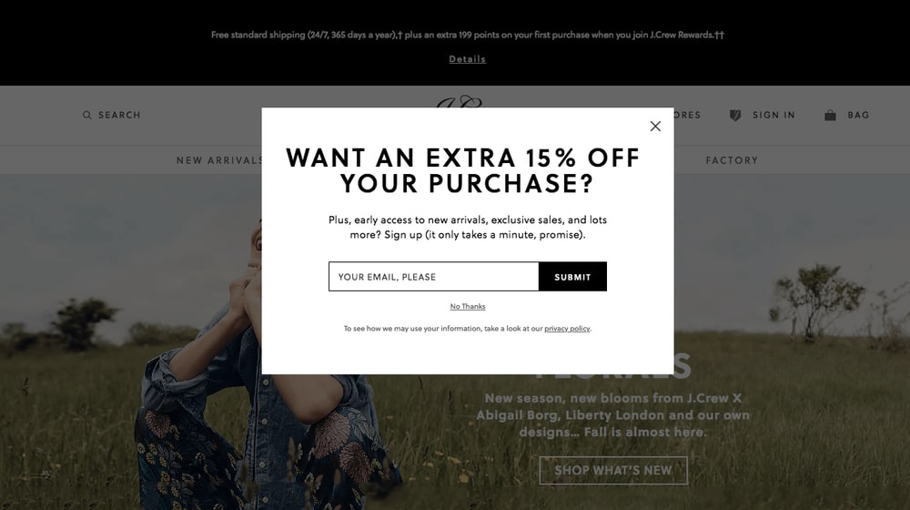
Normal pop-ups are obnoxious and disruptive. Exit-intent pop-ups are engineered to only trigger when you make motions that indicate you're likely already leaving, and disrupt you from leaving with the call to action. They're pretty annoying and a lot of people hate them, myself included, but guess what: they work. They work well enough that even I am willing to compromise and use them. They do tend to work best if you have something to offer as well, though.
Slide-in boxes. Something of a counterpart to exit intents. Where an exit intent pop-up goes off if the user is leaving, a slide-in box triggers if they've stuck around. Sometimes they're time-based, but most of the time they trigger based on scrolling. Once a user gets, say, 70% of the way through your blog post, the box slides in.
These boxes are unobtrusive, but the motion alone is enough to attract attention. They're passive, but they have some active motion to keep attention. They're small and easy to fill out, and they work quite well.
Sidebar CTAs. A sidebar CTA is similar to both a slide-in box and a standard vertical banner advertisement. Take a look at ProBlogger. See there, on the right-hand side, there's a newsletter call to action? That's a sidebar CTA. Simple, easy, passive, but effective.
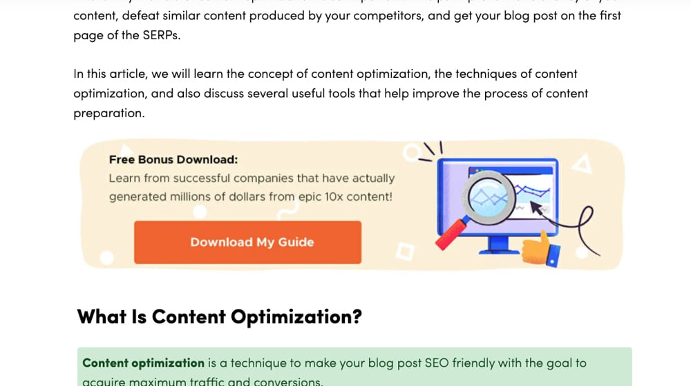
Interstitial CTAs. Normally, interstitial refers to between pages. Forbes used to be notorious for these; you couldn't even visit their site without one popping up. Google hates them, though, so the modern interstitial is mid-content instead of between pages.
An interstitial call to action is typically a box that appears part of the way through your content, containing a call to action and a form the user can fill out. It usually has a textual call to action attached to it, something like "If you're enjoying this, why not subscribe for more?" They're not disruptive and they don't get in the way, so they're perfect to capture the attention of your interested visitors.
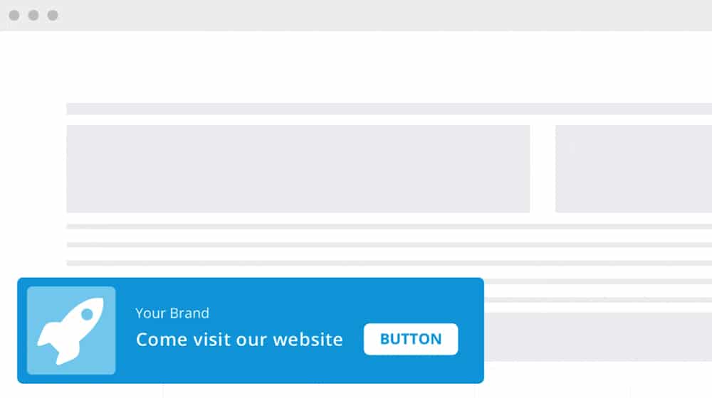
Hello Bars. By now you probably know what a Hello Bar is. They're those bars across the top of the screen that float when you scroll down. They usually have a message, which could be anything from a sale notification to an announcement to a countdown. They also often have a call to action form built-in.
Hello Bars are deeply customizable. You can put almost anything in that little bar as long as it fits. As such, they can be very effective revolving CTAs. They can also be positioned at the top or bottom of your pages.
Content gates. I'm not usually a fan of content lockers or content gates, but I thought I'd bring them up in case you want to give them a try. A content gate is a lock part of the way through your content that blurs out or hides the rest. It asks a user to sign up to bypass it. If your content is compelling enough and if the user is interested enough, they'll fill it out to proceed. Usually, though, they won't be.
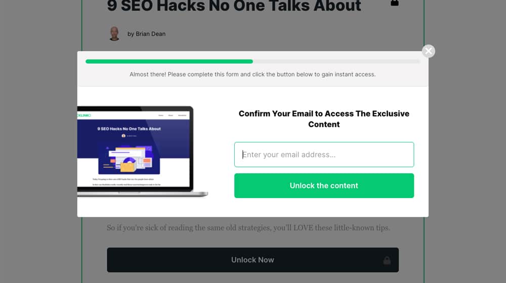
There are two ways to implement these. One style locks specific pieces of content off and requires engagement to get past. The other is more like what Medium.com does; gives your users an allotment of free articles per month and locks the rest once they reach it. The former is more secure but has issues with SEO, while the latter is more easily indexed but easier to bypass.
Content Promotion
I mentioned above that a call to action can include a simple sentence in your blog posts, and that's true. You can do those manually (such as if I asked you to contact me right now), or you can use a plugin to do them automatically.
The primary way of accomplishing this is simple - make the occasional reference to your newsletter and the value of signing up. This could be a mid-content or end-content paragraph that is casually referencing your mailing list. It might look a little something like:
"Did you enjoy this post? We publish new content every Wednesday. To be the first to see our new content, as well as get exclusive deals and other value, sign up for our mailing list!"
That's it. A call to action doesn't need to be overly complex, plugin-powered, or intrusive. Simply remind your audience that, if they made it this far in your post, they must have liked something about it, so why not take a simple action to get more?
One of my tips for this is to make sure you mention that you don't sell user emails and you don't spam them. A lot of users are hesitant to give out their email addresses these days simply because of how their information is so commonly sold by big businesses.
You can find a ton of tips on how to do this smoothly, and how to optimize other forms of call to action, in this post.
Audience Targeting
Another factor to consider as part of your newsletter calls to action is audience alignment.
What do I mean by that? Make sure that the people you're attracting to your site match the messaging you're sending.
A cooking blog that caters to paleo fans isn't going to get signups for a newsletter that promotes itself with vegan recipes. Your calls to action should make sure they're aligned with the interests of your users.
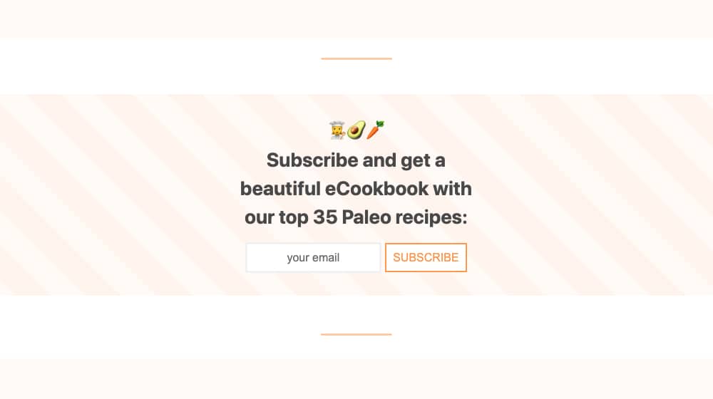
It's important to remember that "the interests of your users" and "what you think their interests are" can be different. More than once, I've seen companies end up successful despite not quite knowing what their audience truly wants. Sometimes they're able to pivot and capitalize even more. Sometimes they stick to their guns and fail. You don't want to be in that second group.
Sign-Up Incentives
One of the best ways to get people to sign up for your mailing list is to offer something in return. We all have a hundred mailing lists we're on that we never really cared about, but maybe we signed up for a tangible reason. What kinds of things can you give away as incentives?
eBooks and other freebies. One of the most common incentives out there (and one that I've used) is the free eBook download. I often need to read pretty deep on a topic to write about it, so claiming free ebooks often gets me to sign up so I can read them. It works, but it does require a significant investment in the content that you give away.
Discount codes. If you have a storefront and you're not operating on razor-thin margins, you can offer a discount code as a sign-up bonus. Something as simple as 10% off might not incentivize many people to make a purchase that they weren't already going to make, but it's more than enough to get them to give you their email address. It's like paying the user for their email address if you think about it.
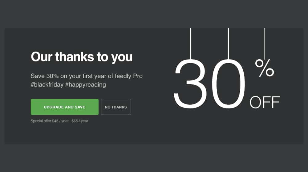
Giveaways. If you have something tangible to give away, run a monthly giveaway for your subscribers. A lot of people will sign up just to have the opportunity to win something. Just make sure to follow the Prime Directive of Giveaways; make sure you're giving away something relevant. If you give away the latest iPhone, you'll get a million subscribers, zero of which care about who you are or what your newsletter is about. All they want is a chance at a free iPhone.
Access to exclusive content. Foster the atmosphere of a community by using your newsletter to let people in on a secret. By "secret", of course, I mean tips, tricks, and information that they wouldn't otherwise get. We're not talking content lockers here, where the blog post is otherwise available. No, these are the tips and tidbits that aren't good enough to make it into a full blog post but work well as a small bit of information for your fans.
Of course, the more you can offer, the more people will jump at it. So long as it's relevant value and keeps people engaged, that's a win.
Plugins and Apps
I've mentioned a lot of calls to action throughout this post, but other than the simple textual options, how do you implement them? The answer, usually, is plugins. WordPress and Shopify both have plugin systems that allow you to use calls to action.
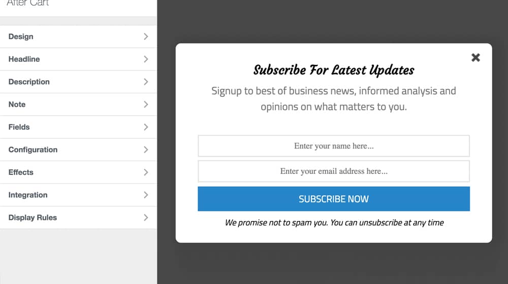
Here are some of the best, though this is by no means a comprehensive list:
- WordPress – Ultimate Blocks – This is a plugin for WordPress's new Gutenberg editor. It adds a range of new block styles you can use, including the call to action block, which works great for interstitial and end-of-content CTAs.
- WordPress - MailOptIn – This is a premium plugin for WordPress with a wide variety of different CTA display options, all designed explicitly for building your mailing list.
- WordPress – Thrive Leads Exit Intent – Thrive is a top-tier WordPress developer, and this plugin is one of their best little offerings. It's a great, customizable exit intent pop-up generator for your disruptive CTA needs.
- WordPress – Contact Form 7 Gated Content – This is one of those content locker options. Feel free to play around with it and let me know if they're effective for you.
- WordPress – Hello Bar – The one that started them all, the eponymous Hello Bar. You know it's good when the brand name is synonymous with the product.
- Shopify – CTA Buttons – This is a Shopify app that adds buttons along the side of your store or Shopify-hosted blog, with the various call to action options like WhatsApp and SMS messaging.
- Shopify – Accept My Marketing – Part of a call to action for your email list is getting users to accept that you'll send them messages. This is a companion app for Klaviyo and Mailchimp that helps with this process.
- Shopify – Instant CTA – This is a product-focused call to action plugin, but it can be used to accentuate sales and newsletter sign-ups as well.
- Shopify – Socital – Socital Exit Intent is another exit intent pop-up plugin, made for Shopify rather than WordPress. It's customizable, easy to use, and works just fine.
There are dozens of other plugins, of course, but it's hard to recommend anything specific without knowing what it is you want to focus on. Just browse the plugin and app directories and you're sure to find something that suits your needs.


 30 Second Summary


Comments