15 of The Best Shopify Blog Examples for Inspiration

Shopify is one of the best platforms available for starting up an eCommerce storefront in a matter of days. That is, from a storefront perspective. Some of the other platform features are a little less than stellar, and some are downright lacking, but that's okay. It's very much an introductory-to-intermediate platform, not meant for larger businesses or unusual endeavors.
One thing I like looking at when I find a new site is their blog. I'm a content marketer at heart, so I like looking for what a business is doing. Are they putting real effort into it? Are they doing the bare minimum?
With Shopify, the blog system included with their platform is very basic. Yet, there are quite a few brands out there that use it successfully. Here are fifteen that I've picked up and identified as having something unique, valuable, or just done well.
When I'm looking at a blog, I tend to look for some specific elements.
- How does the blog use images? Most blogs on the web don't use pictures as much as they should. They help break up large walls of text, provide context and examples, and give posts more visual interest.
- Calls to action. Where do they place their CTAs, what are their offers, how are they pitching them? Many Shopify blogs use a similar selection of CTAs, but how they use them (including how they style them to stand out) matters a lot.
- Site design. Simple Shopify sites are pretty bland, but a few simple tweaks can make a website stand out. More importantly, custom code can open up many avenues for a brand willing to make that investment.
- Two aspects of content stand out to me; relevance and length. I'm a big proponent of long-form content, which is why all of my posts are at least 2,000 words. Many of the sites on this list (though not all) have blog posts that are at least that long. Many of the articles I write and link to are much longer. Relevance is essential as well; a narrow focus on a specific topic helps a lot with SEO. Conversely, one issue I see frequently is blogs that mash 2-3 barely-related posts into one another, convert the titles into subtitles, and call it good. It doesn't work, in my experience.
- User experience. Some Shopify blogs layer themselves so profoundly with CTAs, ads, and plugins that it becomes hard to read the content. There's such a thing as moderation in design, after all.
So, keep an eye on elements like this in the sites I list.
 30 Second Summary
You can use Shopify to quickly start an eCommerce store, though it works best for small to medium businesses. When you look at successful Shopify blogs, you'll find they share important features you should add to your site. You need eye-catching images to break up text, strategic CTAs to convert readers and clean site design that's easy to navigate. You'll want to write long, focused content about topics that matter to your readers. The best Shopify blogs also carefully balance promotional elements without overwhelming the user experience.
1: Skinnydip London
I have a lot of complaints with Skinnydip's blog here. All of their posts are very short, and some of them barely have any words at all. It's not going to show up quickly in web searches, that's for sure. However, I like how they use Shopify's ability to embed products directly into the blog post to showcase what they're talking about. Considering most of their blog posts are announcements of collaborations with other groups, designers, or artists, that works out well.
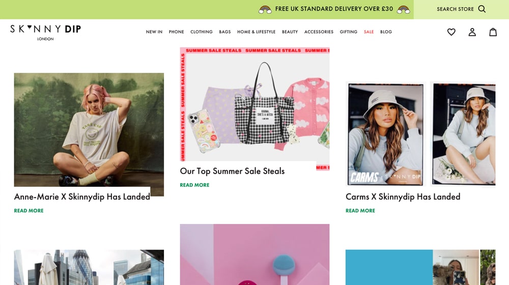
What I'm pointing out, though, is the call to action at the bottom of the post. It's a big box, colored faintly to stand out from the background, with an email opt-in. As an incentive, Skinnydip London gives you 10% off any order. Since most people visiting their site will likely be interested in shopping already, this is a great incentive.
2: Bulletproof
There are two things that I like about the Bulletproof Blog. First, at the top of each post, highlighted in gray, is an "at a glance" summary of the article. It's not the table of contents (that part comes later), but it gives readers an overview of what they will find in the post. It's an easy way to ensure readers get what they want out of your content.
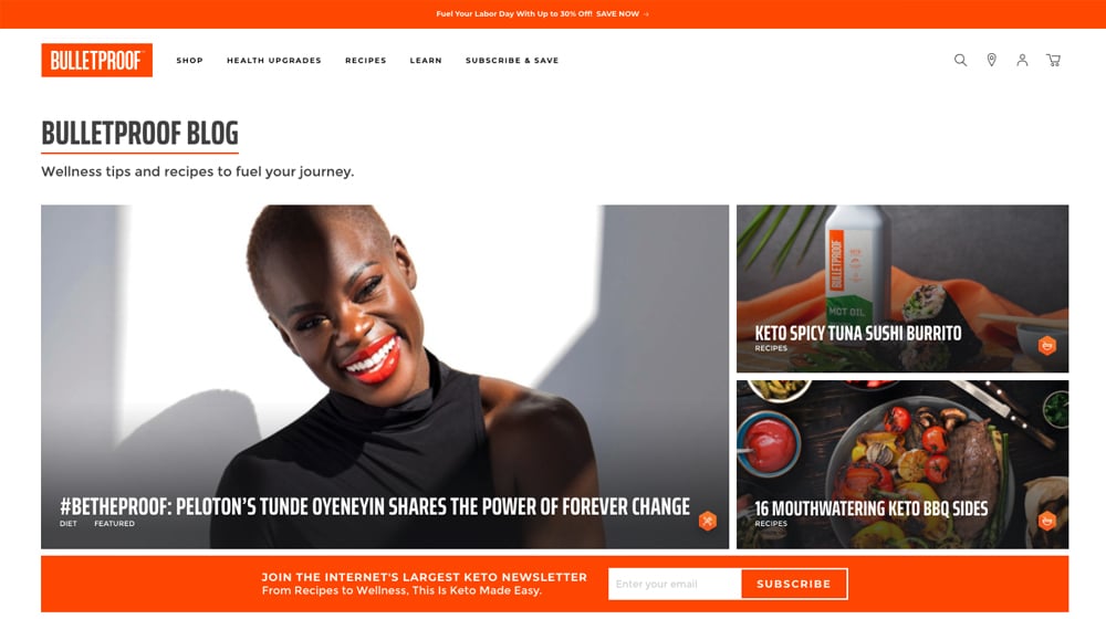
The other is the assorted interstitial boxes along the way. In particular, the featured product boxes are an excellent way to include a graphic call to action without being too disruptive. They also have custom "related post" boxes along the way that keep interested users reading.
3: Rebecca Minkoff
This website is another example of using the feature that makes a Shopify blog unique out of the gate, featuring products inline in the blog. The linked post is a simple post about turning a scarf into a mask (from the start of the pandemic, before face masks were standard) and then selling scarves. Simple, easy, good to go.
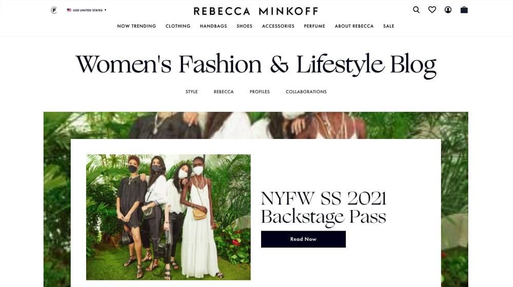
Also, notice the same discount-for-email call to action box at the bottom of the page, just like Skinnydip. However, buried beneath the product images and above the footer, it blends in with no background or border. Highlight it, Rebecca!
4: Heinz to Home
Heinz is the company primarily known, in America anyway, as the ketchup company. Around the world, they produce a variety of different condiments, and this UK-based blog is a more robust brand presence than you might expect. It's not even ketchup-red! And that's part of the magic.
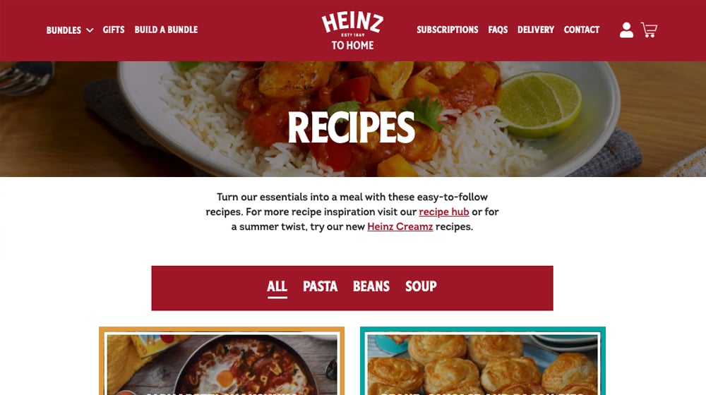
This website is a highly customized Shopify theme that even changes color for each recipe they post. It just goes to show that Shopify is a very flexible platform if you're willing to invest in the custom code for some of those features. It goes a long way to improve the user experience.
5: Pixi
This site is an example of a great blog across the board. It has decent content with a good length, lots of attractive pictures, and even a custom plugin to insert charts and tables into the post. It uses the embedded products feature too.
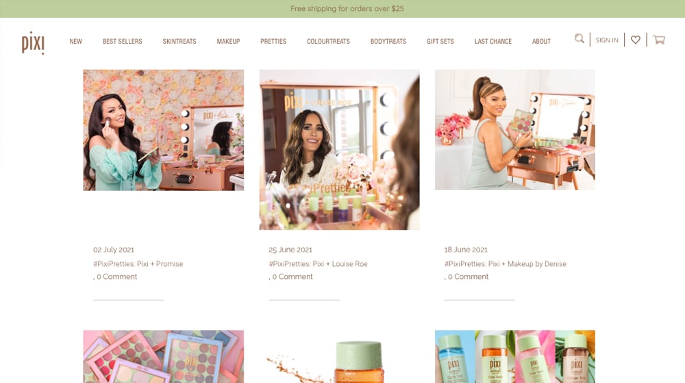
They did an excellent job with their design and color pallets. Plus, from a marketing standpoint, it has a friendly sticky call to action at the top. It just shows that even a simple design can work well when you optimize every bit of it.
6: BestSelf
This example is a Shopify blog showcasing the various calls to action you can have on a page.
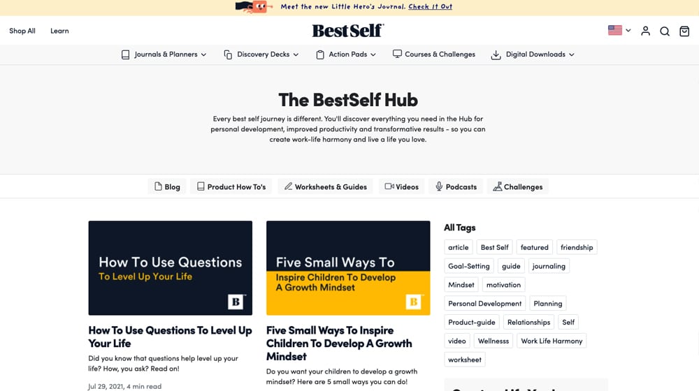
It has:
- An exit-intent/timed pop-up with a 10% off coupon if you sign up.
- A subtle bar across the top promoting a recent piece of marketing.
- A FOMO pop-up in the corner showing recently purchased products.
- An embedded product link you can use to buy the item they mention.
- A sticky nav bar to ensure you can always see their navigation in the post.
My only gripes are about user experience. Their blog topic research and content quality are both excellent. Unfortunately, they desperately need images in their post, and they could use a little more color in general.
7: Beardbrand
This website has an elementary blog if you look at it. Simple font choices, a few images, a pretty basic design. So, why is it on my list? Well, examine the content itself. This brand knows its target audience and doesn't bother trying to be a generalist about it. They write highly focused, high-quality blog posts and let the content speak for itself. As a consequence, they rank pretty well for a lot of beard-related topics.
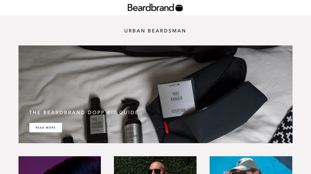
Heck, the post I linked is 5,200 words long. If anything, I might split it into 2-3 other blog posts and use the "ultimate guide" version as an eBook upsell, but clearly, this option is working for them, so why change it?
8: Gymshark Central
Gymshark is an apparel company for gyms and exercise. Since there's not much you can write about gearing specifically for training for a general audience (though there are tons for specialists), this company has taken their blog in the broader exercise direction.
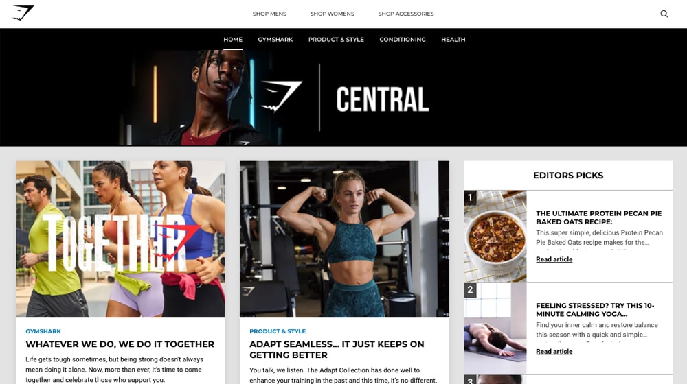
They have plenty of pictures and gifs to showcase the exercises they're highlighting. They also don't try to push their apparel too much. They're here to show you what can be done with various activities, and if you want gear to make it easier, well, why not get it from this gym that has been so helpful?
9: Deathwish Coffee
While Deathwish Coffee doesn't have the best topic research for attracting an audience of coffee fanatics, their blog design is quite good. Their floating nav bar at the top with their round logo popping out shows just how versatile and brandable Shopify can be with a custom Shopify theme.
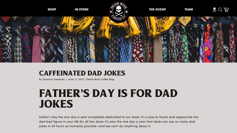
Their blog focuses primarily on images with a giant featured image section and plenty of visuals throughout their blog posts. They did an excellent job matching their blog theme with the rest of the site. Still, I can tell that their blog is a bit neglected, and most of their blog posts seem to be news-related and content to feed their social media pages, instead of the quality coffee-related evergreen content we would have liked to see.
10: Luxy
The Luxy Hair Blog nailed its design and strategy. Their blog topics are spot on and attract visitors who are potentially interested in their products, and their theme is finely tuned and effective. Their calls to action are visible and attractive in their sticky sidebar, and their blog posts are loaded with helpful images.
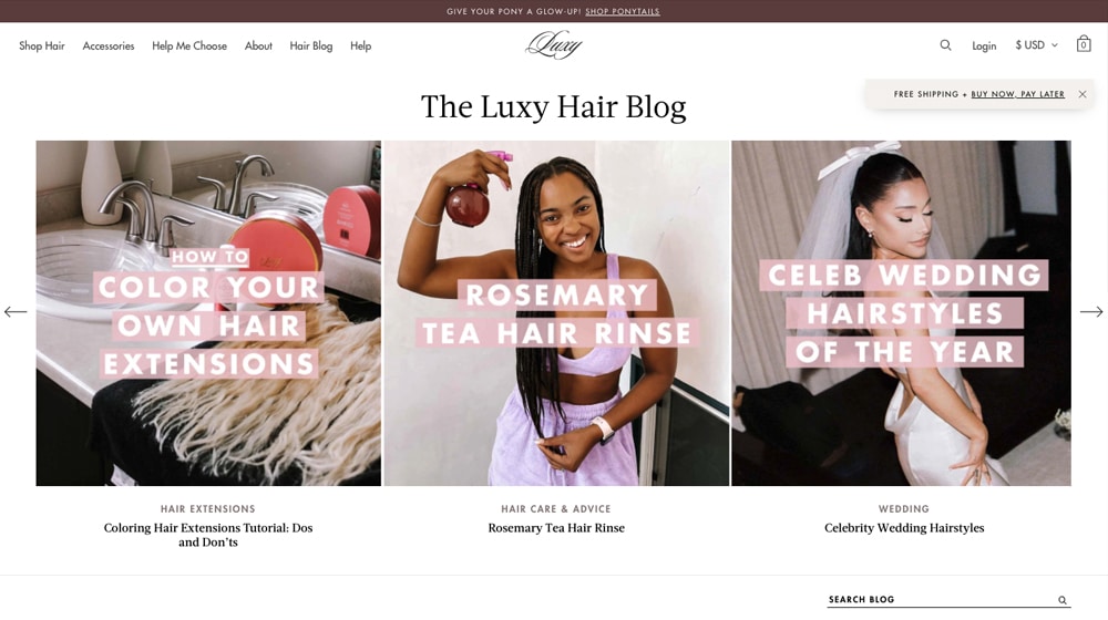
They also made great use of the Shopify product functionality by including every product they highlighted in their blog post after the article. They titled this section "Shop the look" and gave it some attractive custom styling.
This site is an example of a Shopify blog done right, folks. Their blog is one of our favorite examples on this list of what is possible on Shopify.
If I had to nitpick something that they could have improved, their font size is a little too small. It's set to 16px on a desktop device, which is suitable with some fonts, but their font choice is slightly hard-to-read at this size. I think it would improve user experience to increase their font size to 18px.
11: The Ridge
The Ridge is a company that sells a narrow set of accessories: phone cases, wallets, backpacks, and charging cables. It sounds eclectic until you realize the theme that unites all of them. That theme focuses on slim form factors, security, multi-functional capacity, and a slick design. Their blog reflects this in discussing those specific concerns. If you're the kind of person who worries about, say, RFID skimming for your credit cards, they write content for you.
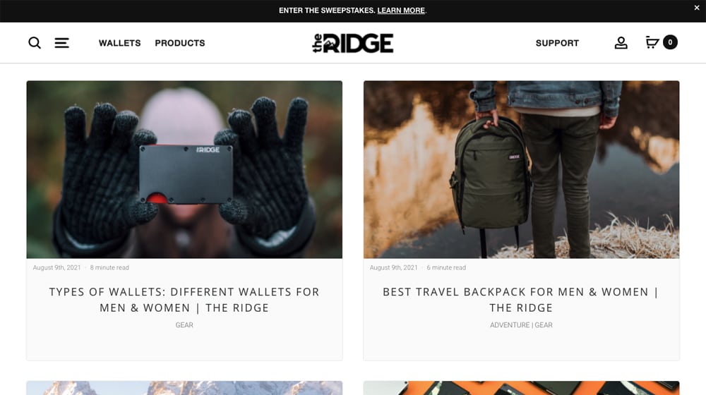
They are good at images, good at content, and have a good design. They could maybe use more calls to action or slightly more in-depth content, but as it stands, they're doing quite well.
12: Huel
Huel is one of the primary competitors to Soylent as a single nutritionally complete meal replacement drink. Their blog is interesting because the blog index is more of a giant table of contents than the usual grid feed you see on most blogs.
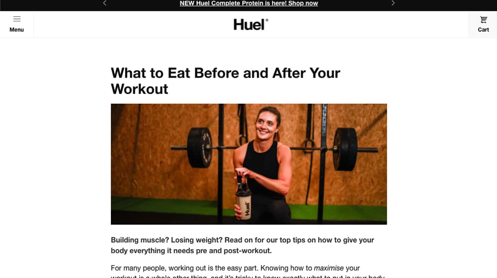
They publish content relatively rarely as a consequence, but you can see everything they've created on their index. The actual blog posts are well-written, have good formatting and images, and have the occasional embedded CTA, making it a pretty robust design.
13: John's Crazy Socks
This Shopify site is a cool one. John's Crazy Socks does charity work with the Special Olympics, and the founder, an ambitious 22-year-old man with down syndrome, made over $25 million in the first two years of launching. They utilize Shopify and maintain an active presence by publishing regular updates.
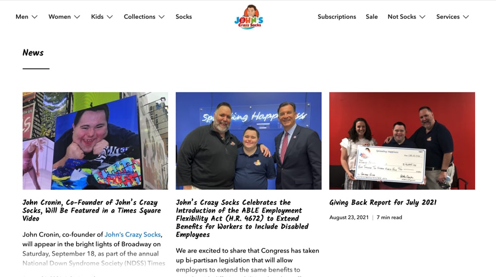
In recent months, their blog is more focused on company news and PR than attracting new visitors from search engines, but they maintain an active presence and publish regular updates. They occasionally publish articles geared towards attracting new visitors, filled with many internal links to socks that they sell.
I love the message, their products, and their charity programs, and they effectively communicate with their audience. I feel like they could benefit from an email opt-in to build a large audience and keep their customers and visitors up-to-date, and perhaps splitting their blogs into two sections; news and blog.
14: Tushy
Tushy is a brand centered around your butt. Everything they do has to do with healthy bathroom habits, from diet to cleanliness to tools. They have a great sense of humor about it, which is a powerful source of branding for them.
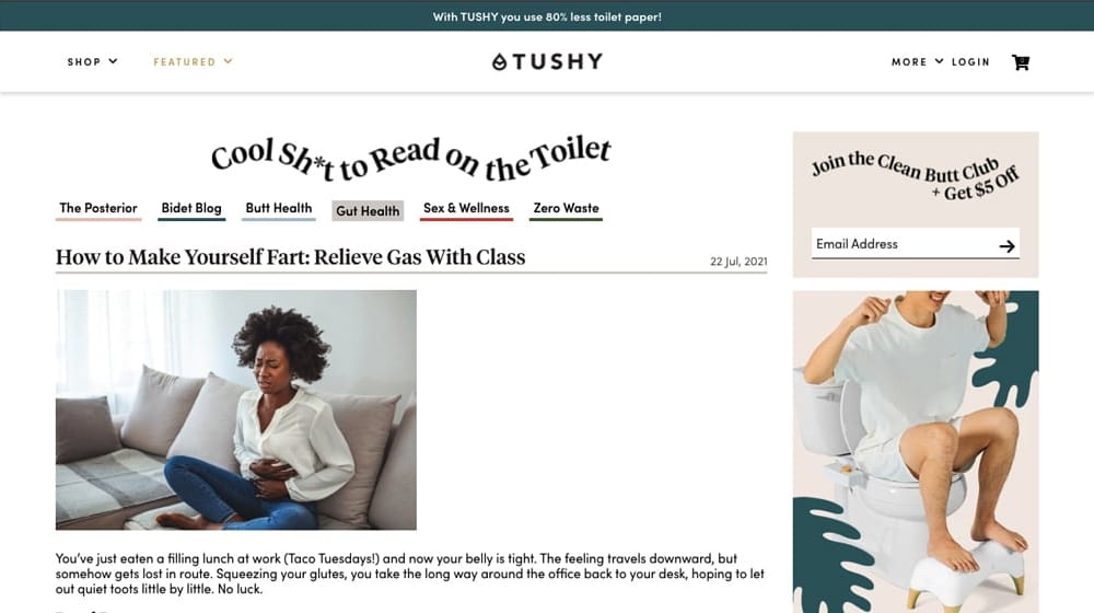
They make sure to work in their products in their content (but only where applicable!), and they have a great iteration on the discount call to action at the bottom. My gripe, again, is primarily with images, in that they don't have many. They could be creative and add more if they wanted.
15: Pretty Litter
This example is another pet-centric blog, but this one is focused on cats rather than dogs. Like the dog digest above, this one effectively explains deep, niche topics relevant to cats and cat owners, no one else. Their blog index is very graphical and compelling, and their post layout has room for CTAs on the left side, which is a little unusual and draws the eye.
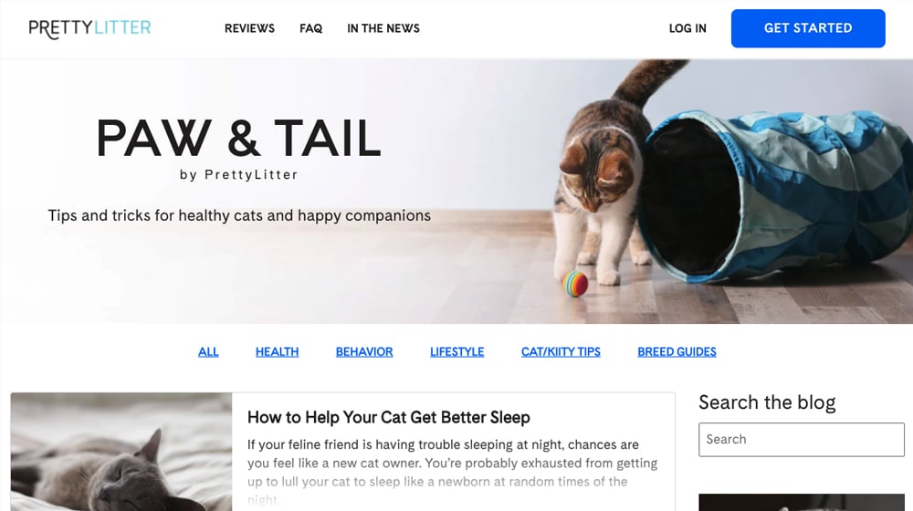
They have a top banner CTA, but it's not sticky, so it's easy to lose. They do, however, replicate the same CTA as an interstitial box, so that works out.
Did any of these examples give you inspiration for your Shopify blog? Do you have any examples you'd like to share? Please share with me in the comments below! I'd love to add them to the list and get a conversation on Shopify blog optimization started.


 30 Second Summary


February 06, 2022
These are great inspirations, James! I love Heinz to Home's use of color! I'll definitely take a closer look at that.
February 10, 2022
Thanks Eryn! I liked their site, too. Their color-coordinated design is clever.