What Is The Most Effective Call to Action for Blog Posts?

In some ways, the call to action is the most important part of a blog post. Without it, your blog post is just… there. It brings in people from Google, from social media, and from other channels, but those people read it and then have nothing else to do. Maybe they click a link, maybe they back out, maybe they close their browser and go for a walk, finally free of the endless cycles of the internet.
With a call to action, you can instead convert those people into new followers, new subscribers, and new customers. You tell them, clearly, what it is they should do next if they like what they read.
The question is, what's the best call to action to use? Is there one specific phrase you can staple to the end of your posts to get those sweet, sweet conversions?
 30 Second Summary
You need a strong call to action (CTA) at the end of your content to turn readers into followers or customers. You'll get the best results when you pick one clear goal for your CTA and place it where it makes sense for your readers. Your CTA should be short (3-5 words), start with a commanding verb and highlight the value readers will get. You have to test different versions to find what works best with your specific audience.
The Ideal Call to Action
The single best call to action is this: the one that works. That's right. I said it. It's just the CTA that works the best. You know what it is? Get ready:
Here it is:
…
Wait, did you really think I knew one secret special phrase that was better than all other calls to action? Of course not. There's generally no such thing as the "best" call to action, the "most effective" call to action, the "greatest" call to action. If there was, every single marketer in the world would have run it into the ground roughly thirty seconds after it was discovered.
In fact, one call to action might not even be the best call to action on different pages on your website, or even on different locations on the page. You have a lot to consider, and a lot to test.
Call to Action Considerations
When you're figuring out the best call to action, you have to put constraints on what you mean by best. Different factors can influence how good a call to action is. Let's discuss those factors.
First up, you have the location of the call to action. There are a whole lot of different places you can put a call to action. You can put one in the middle of your blog post, or in the last paragraph of the post. You can put one in a stand-alone lead generation box in the middle of the text, or above or below it. You can use slide-in boxes. You can use persistent or scroll-triggered shutters or top of the page bars. You can use exit intent pop-ups. Every single one of those will work differently with the same call to action, because the mindset of the person looking at it at any given time will vary.
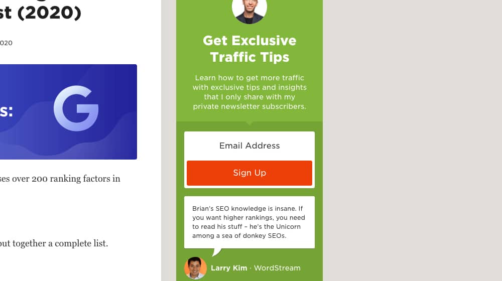
Second, you have the goal of the call to action. Are you trying to get more blog comments? Do you want more email subscribers? Do you want people to click through to a landing page or a product page? Are you trying to get them to make a purchase? The goal of the call to action influences the language you use to write it, and how effective it may be.
Third, you have to consider the reader's position in your sales funnel. One blog post will have people who have never been to your site before reading it, alongside people who are already paying customers, alongside people who have signed up for your newsletter but not much else. Each of these people will react differently to the same call to action. After all, your customer doesn't need to click through to your landing page, and the newcomer might just want another educational post first.
Examples of Great Calls to Action
Now let's show you some real life examples of calls to action, in their native environments. What can you learn from these?
Crazy Egg – "Show me my Heatmap" – Crazy Egg is a company that provides user tracking services, particularly displayed as a website heatmap.
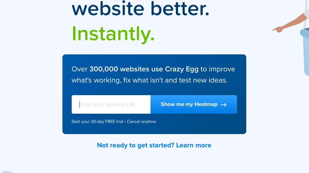
This call to action has been so effective they've been using it for years. What can you learn from it?
- This is an example of a call to action that doesn't work for everyone. I couldn't use this call to action for anything I do, because I don't provide heatmaps.
- The call to action has a very strong personal focus. It's not "see your heatmap" or "get a heatmap", it's a direct request phrased from the reader to see MY heatmap. It adds personal stakes in a subtle way.
- Surrounding text is minimal and focused. This page tells you that the heatmap is risk free to try out, and answers a couple of the major questions a user might have preventing them from clicking through.
Quick Sprout – "Start Now" – Quick Sprout is a marketing company that specializes in growing businesses quickly with high-end expertise.
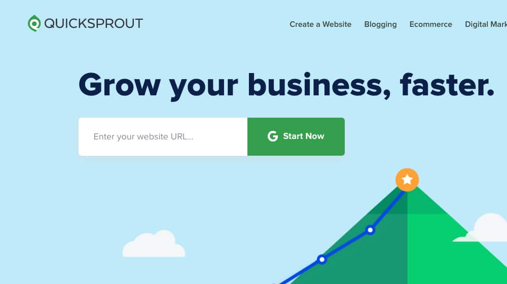
They provide data, consulting, and tools to help a business grow. Why is this call to action good?
- Everything on the page above the fold is focused on the CTA. Even the image is a graphical showcase of what a business can expect.
- The G logo on the green button indicates that you'll be signing in through a Google account, which is quick and easy for many people.
- The single field asking for a URL and a single-button sign-up combines with the call to action to emphasize how quickly and easily you can get started.
Wordstream – "Grade My Google Ads Account" – Wordstream is an online advertising agency with incredible amounts of expertise at their disposal.
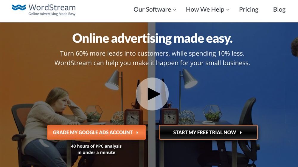
Their homepage here promises to provide 40 hours worth of PPC analysis in under a minute by clicking the grade button. Why is this great?
- They promise something that could cost hundreds of dollars from other companies, with a single click. It's a great value!
- Like Crazy Egg, they use "my" to get you personally invested in their call to action.
- "Grade" as a verb here indicates that the analysis of your account will be scientific and ranked based on known factors; a rigorous study data-driven marketers love to see.
That's just three examples of calls to action you can find out there in the wild. You can bet that all three of these companies have spent a significant amount of time split-testing and optimizing these CTAs. They clearly work.
Tips and Rules for Writing a Great Call to Action
When you're writing a call to action, you need to keep a lot in mind. I've distilled as much of that wisdom as I can into individual tips. Keep these in mind – heck, use them as a checklist – and you should be well on your way towards developing a great call to action.
Encourage immediate action. You want your readers to take action as quickly as possible, so formulating your call to action to encourage immediate action – rather than a "wait for a better deal" or some other kind of inaction – makes your CTA that much more effective. You can do this with action words, with time sensitive context, and simply by using time-based words like "now" in your CTA.
Focus on a single goal for your call to action. The more you want your CTA to do, the less effective it will be. That's why simple "click now" calls to action aren't very effective. If you want subscribers, use a "subscribe now for great insights" call to action. If you want sales, "don't miss out, buy now" can work. If you want people to leave comments on your blog post, well, how about you tell me how you'd do it in the comments below?
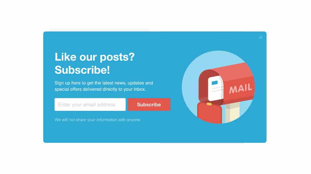
Emphasize the value the user gets. This isn't always part of the call to action itself, but should be part of the context surrounding it. When the call to action is something like a free trial, a free audit, or something of the sort, it pays to include something about it in the call to action like in the examples I gave above. In some other cases, it's better to keep your call to action focused on the risk, while the context provides the benefits.
Emphasize the minimal or nonexistent risk the user takes. "Start my free trial" is a good call to action because it emphasizes that the value the user gets – a trial of the service – has very little risk attached to it, because it's free. Showcasing that the action is low or no risk makes it an easier sell for the reader, who doesn't want to be locked into anything or sign up for spam they don't want. This is also why many subscription-based calls to action have a line below them about "we will never sell your information", to assure readers they won't be spammed.
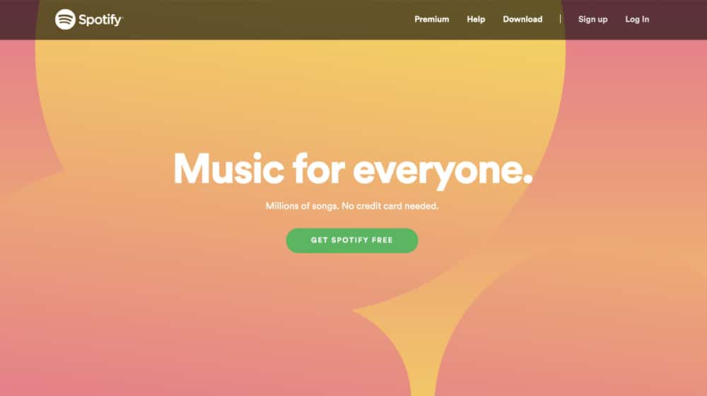
Remember the placement of the call to action. Placement matters! A call to action at the top of a page can promote a time-sensitive deal that a returning user might want. A call to action at the bottom of a post can promote something they just read about. An exit intent pop indicates the user was ready to leave, so it should be short and encourage them for the bare minimum, usually an email subscription. Don't ask for more than the context allows.
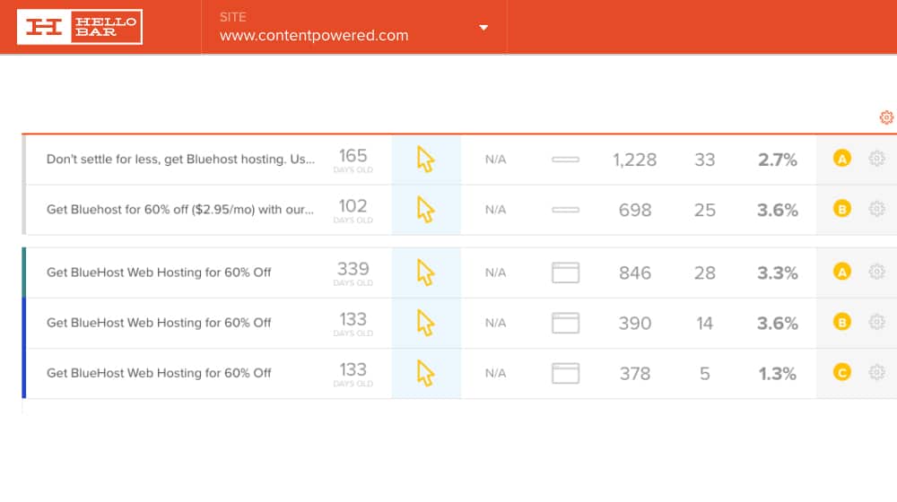
Optimize your call to action over time. The true secret to every good call to action is that it's only good for a little while. Evergreen-seeming calls to action, like Crazy Egg's version they've kept around for years, are rare. Most companies change out their call to action on an annual basis, if not more often. The goal is to keep testing different calls to action with your audience, iterating over time, to identify what has the most compelling structure and language to get the most effect. Learn and love the split test, my friends!
Keep your call to action short. How long should a call to action be? Most of the time you're going to see something in the 3-5 word range. Sometimes it'll be as long as 7 or 8 words long, and sometimes you'll see a CTA that's only 1-2 words, but those tend to have more context surrounding them. "Start now" is a generic call to action that's not very compelling unless you have the context of the page telling you what you're getting when you click to start. The longer your call to action is, the less effective it will be.
Use a strong, commanding verb to start your call to action. A commanding verb is a verb that indicates some level of strong action. Words like "buy" and "order" are good. "Download" and "subscribe" are common for newsletters and ebooks. "Discover" is better than "find out how…" because it's shorter and snappier. This is one case where it can be a good idea to check a thesaurus, so long as you're not using words no one would know.
Avoid the passive statements. You tend to see this with certain kinds of calls to action, such as downloading an ebook or case study. "Our new book is now available" is not a call to action, it's an informative statement. You want something more like "Download Book Title Now!"
Use words that promote an emotional response. Emotional resonance is very important for a good call to action. Emotions don't need to be strong to be effective. "Join 100,000 of your peers today!" is emotional in that it fosters a sense of inclusion and peer pressure.
Consider ending your call to action with an exclamation point. The simple, humble exclamation point is often over-used in marketing, but a call to action is the ideal place to use it. It adds just a hint of excitement to the statement, a bit of emphasis, a way to indicate that, yes, this is the right thing to do. "Click here" and "Click here!" are two different statements. You're more likely to want to click on the second one, and those are the most generic possible calls to action you can make.
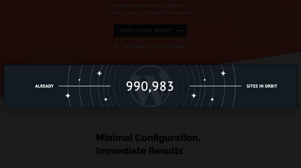
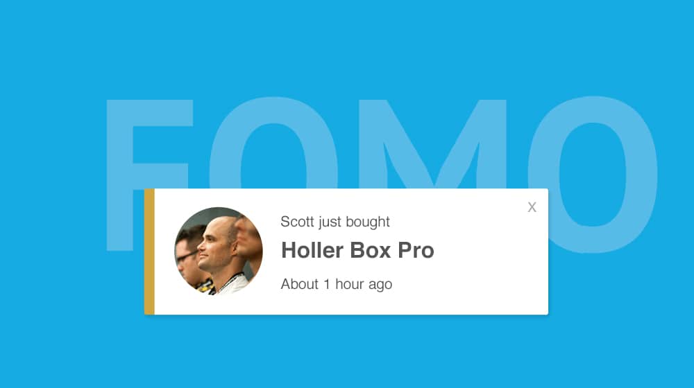
Make use of FOMO if you can. FOMO is the Fear Of Missing Out, and it's one of the most powerful emotional resonances you can ask for with marketing. It's most useful when you have a limited time offer that the user will definitely miss out on if they don't sign up now. Making use of FOMO means using a call to action like "Get Yours Before They're Gone!" alongside a quantity ticker that slowly ticks down. Timers, limited quantities, limited seating; these are ways to put a cap on the number of people who can click, and makes an interested user more likely to press the button.
Split your call to action between device types. This can be somewhat of an advanced trick, and may require integration with a responsive design. The goal is to customize your call to action – and potentially other content – to the kind of device browsing your site. Desktop computers can use more traditional calls to action, while mobile devices should use "tap" instead of "click" and can use more tactile words and phrases, like "at your fingertips", to indicate that they quite literally hold the power to obtain something in the palm of their hands.
Consider weaponizing negativity. Using negativity can make for some powerful calls to action in specific niches. Health, maintenance, home improvement, and other such niches can benefit by almost insulting the current state of their readers, to further push them in the direction of receiving your help. For example, "Your garden sucks: click here to fix it" for a gardening or landscaping company. I've seen this a few times with blog management and SEO companies, but it tends to drive away people who have spent a lot of time and effort in their blogs; they don't want to click a link acknowledging that their effort was all for naught.
Don't forget graphical elements in your call to action. There are all kinds of little graphical touches you can optimize in your calls to action. Use visual design to draw the eye towards a button, like an arrow or the dotted line trail of a paper airplane. Use a bright color – and split test the color – for the button, so it stands out from the rest of the page. Even subtle elements like a brief button animation can help make your CTA stand out.
What about you? Do you have a favorite tip for crafting your own call to action? I'd love to hear what you have to say, so please, leave a comment with your thoughts. What's your top tip?


 30 Second Summary



January 12, 2021
Great ideas here! Thank you so much for sharing
January 14, 2021
Hey Debra, thanks for the compliment!
Glad it was of some help to you.
February 09, 2021
Hey James. My wife has an e-comm business and I want to help her with marketing. She has her own simple website and blog that is managed by her VA but haven't had any leads yet. I am wondering if we need to do CRO for her blogs. What do you think will be the most effective CTA for her? She is selling beauty products and vitamins. Thanks for your help
February 11, 2021
Hey Ramon!
If the content itself has issues (poor topic choices, thin content, too competitive, etc) then a well-optimized call to action may not help very much, or at all.
There are simply too many variables to give accurate advice from this info.
Feel free to drop me a line, I'd be happy to take a look and point you in the right direction 🙂
May 25, 2021
I've had good success with FOMO. People get crazy whenever they find out the items are running out of stocks so I recommend this for those with an ecommerce business. I want to build more followers on my blog, do you have any recommendation on what CTA should I use?
May 26, 2021
Hey Matthew, thanks for sharing!
For followers, Sumo.com has a ton of call to actions available to promote a social media page.
I'm a big fan of scrolling call to actions since they stay with your reader - as long as they aren't intrusive or annoying.
August 04, 2021
I like the CTA in your blog. It's simple and it doesn't disturb the readers. What's it called?
August 12, 2021
Thanks, Marcus!
I have a few on here: a scrolling bar at the top (sometimes called a hello bar or notification bar), a newsletter opt-in block after the content, and a live chat plugin.
The first two were created by us in-house, and the live chat plugin is by Drift, though we created some custom code to lazy-load that since it's a bit resource-heavy.
September 27, 2021
Hey James! How many CTAs should a blog have? I am afraid I might overdo it so your professional insight will really be a great help. Thanks!
September 27, 2021
Hi Peggy!
I would say no more than three.
A contextual call to action works very well, as do scrolling calls to action (in the sidebar or a bar at the top).
You could also test a call to action at the end of the article, but these tend to get the least amount of engagement compared to those two.