15 Powerful Ways to Generate Leads with Content Marketing
The primary reason for every business to run a blog is to generate traffic and leads. The content shows up in Google search, people find that content and click through, visitors to your site read your content and your calls to action and turn into leads or even customers.
It stands to reason, then, that you want to create more lead gen content. Lead gen content is content that is explicitly focused on generating leads for you. The question is, how do you do it?
I've seen many posts written about this topic, but frankly, a lot of them suck. They're surface-level content marketing, dressing themselves up as advanced techniques. Like, "develop a buyer persona"? "Use content syndication"? "Promote your content"?
These tips are all Content Marketing 101. If you don't know who you're writing for, where they spend their time, and how to promote to them, you're not even doing content marketing.
I decided I wanted to write a more advanced guide. This post is full of my tips and tricks, parts of the process I used to grow my clients. Sure, I research buyer personas, figure out how to promote content, and all of that. More importantly, I put a lot more thought into specifically generating high-quality content and optimizing it for conversions. So, these are my intermediate and advanced lead gen content techniques.
1. Focus on Evergreen Content
Some blog posts go viral, receiving a massive spike of traffic before dropping off to near-zero. Some blog posts never get traction at all. Some articles, though, seem to grow year after year. Ahrefs did a study a few years back that found that the average age of the #1 ranked search results is 2+ years. Very rarely are the top-ranked articles new posts.
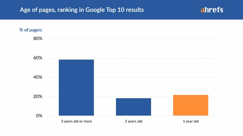
Now, this is contextual. If a user is searching for something that is currently new or trending (say, new varients in the COVID pandemic, which are only a couple of months old at the time of this writing), the top-ranked search results will be younger. That's why content marketing needs to create a mix of different content types.
When I talk about a successful blog, I generally talk about the snowball effect.
- From day 1 to day 365, your blog will likely get very little in the way of returns without significant investment.
- In the second year, you will start to see some growth.
- From year 2 to year 3, it will make the first two years of results look like a pittance.
Every year, it will grow and compound upon itself. It's just like compounding interest in investments, except its traffic/leads/customers instead of dollars.
The key is evergreen content. Time-sensitive content works for a few days, weeks, or months and then becomes worthless. Who cares today about pre-launch rumors for the iPhone 6? A post covering those is timely when it's written but useless the moment there is no longer a need for stories. At most, it has historical value to see what people were guessing.
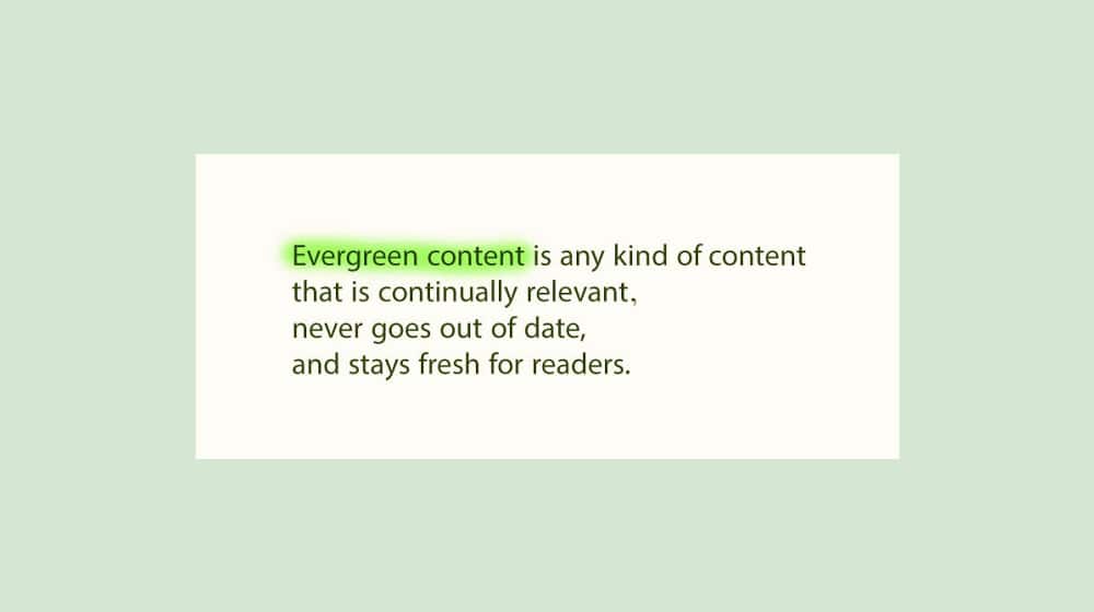
Luckily, evergreen content comes in many forms. You can write lists and listicles. You can write tutorials so long as the problem is evergreen-relevant and the steps are kept up to date with changing tools and solutions. You can write guides for doing things related to your niche (like, for me, keyword research, content promotion, or post formatting.) You can write content specifically addressing common evergreen pain points in your audience. You can create and keep a Frequently Asked Questions document updated and related to your business.
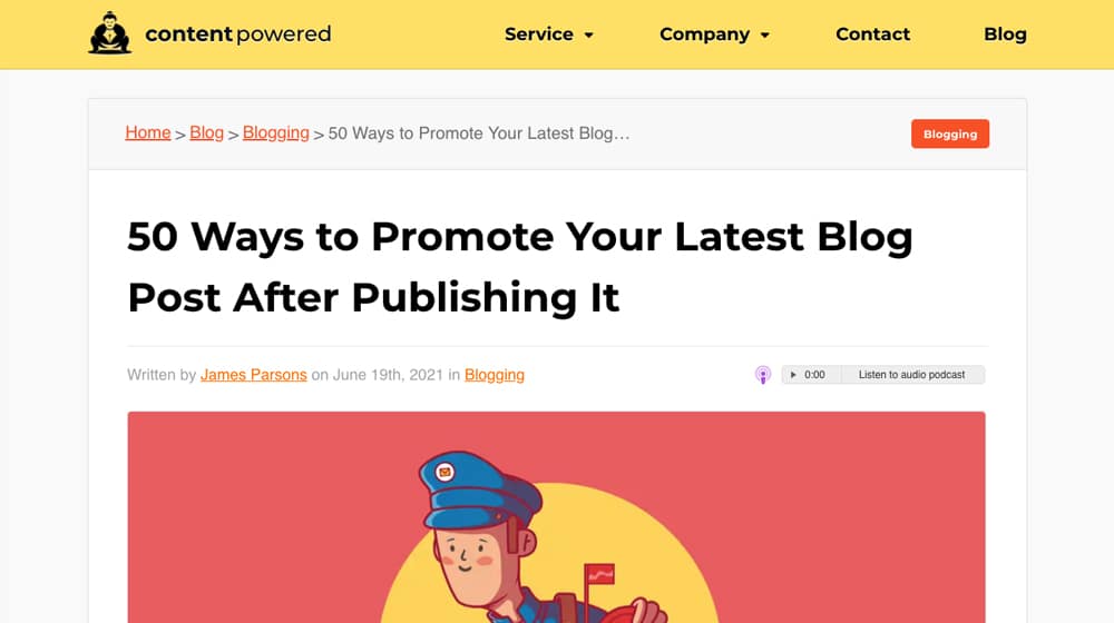
One of my favorite techniques is to look for top-rated evergreen content in a subject within my niche and write 10x skyscraper content to try to outdo it. It's difficult in some topics and impossible in others, but very doable for many subjects.
2. Pay Attention to Search Intent
The number one difference between a casual blogger and a professional content marketer is the awareness of user search intent.
Whenever a person goes to Google, they have a desire they want to be fulfilled. Maybe they want a tutorial for solving a problem. Perhaps they want a recipe they can follow, or they want a list of ideas. Sometimes they want to research a specific product or find a solution to a particular problem. Maybe they want to learn more about a specific topic. Typically, all of these are happening all the time.
To a certain extent, you can get this information from the keywords they use. There are buyer-intent keywords; there are research-intent keywords, and there are simple knowledge keywords. Many keywords, though, are nebulous.

If someone types "content marketing" into Google, what do they want? Do they want an essential guide to what content marketing is? Do they want a company to handle content marketing for them? Do they want a sizeable DIY guide on how to do it themselves?
All three can be accurate at the same time.
Alignment between user search intent and content focus is how you create actual lead gen content. Your job is to find ways to target that same keyword with three different pieces of content, each targeting the correct search intent.
3. Minimize Fluff and Non-Essential Content
"Minimize fluff" is one of those beginner-level tips that, unfortunately, tend to get lost among advanced marketers. Many of us tend to focus on content length and end up adding passages that don't matter.
This phenomenon is why I generally try to keep my sentences and paragraphs short. It's why I make liberal use of lists, subheadings, and formatting.
The goal is to take the search intent that brings people to your site and deliver what the user wants to see as quickly and efficiently as possible. As I always say, "get to the nuggets."

Things like subheadings and a table of contents help a lot with this. Users want nuggets of value, and they have incredibly short attention spans. If you aren't solving the problem, or at least proving that a more profound read will do so, they're going to bounce.
That section you like because of the metaphor you spun up, but that doesn't quite fit? Just cut it. Save it for another post if you want, but cut it from this one. If it doesn't work, it doesn't work. This also ties into the search intent tip mentioned above. If you're writing about an intermediate or expert level topic, do they really need a 500-word recap on the basics? Perhaps, or perhaps not.
4. Beautify Your Posts
I often talk about how to optimize a post for skimming. The elements I typically list are using bold/italics/underlines, using bulleted or numbered lists, using subheadings, and using short sentences and paragraphs.
You may have noticed that I do all of that and more. Check out this snip from my blogging FAQ:
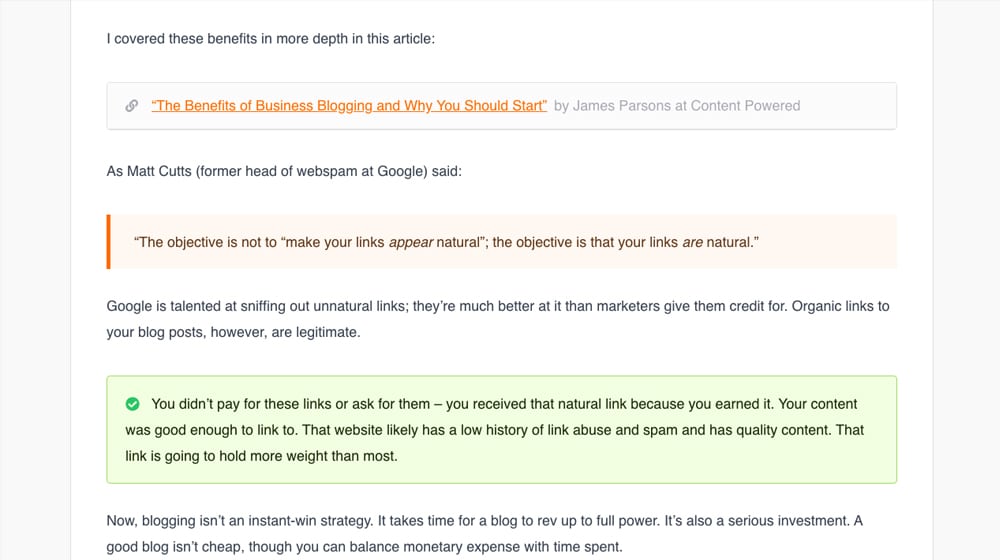
I have not one, not two, but three different kinds of blockquote boxes with various formatting, colors, and highlights in the space of one question. One is for an internal link I wanted to highlight. One is for a quote. One is for a key takeaway from the passage. They all draw the eye, they all give specific value, and they all serve a purpose.
I also frequently use symbols to enhance specific aspects of a post.
It's simple, but it adds value and makes the article a little bit more attractive and easier to digest.
The key is to do all of this while still staying subdued. You don't want your post to look like one of those MLM Facebook messages full of emojis or thin affiliate sites where every sentence is in different font sizes, colors, and background highlights.
The key is to create consistency throughout a post and a website. That formatting for a quote or a key passage? That's the same in all of my blog posts.
5. Optimize the User Experience
When you visit a website, what makes the experience better for you?
The specific answer varies from person to person. If you want, let me know in the comments what your top three most important aspects of the user experience are.
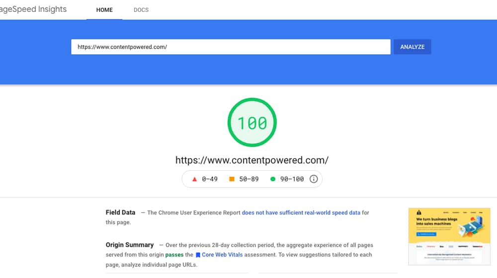
Some of mine are:
- The page needs to load as fast as possible to start reading and extracting the value I came for.
- If I want a specific tip or a specific process step, let me jump to it. I don't want to scroll and look for it. A table of contents with in-page links does this.
- Now and then, a website is designed in a way that has surprisingly low contrast between text and background. Make sure you meet contrast guidelines for accessibility.
- Mobile Usability. Not just basic, bare-minimum usability; I mean the entire mobile experience. One of my most prominent examples of what not to do is the Fandom Wikia system; they have stacks of layered ads on top of one another that you barely get a quarter of your screen to read the content. It's not very fun to use, and it hinders their user experience, which hinders their performance.
These tips are on top of all of the other accessibility and design requirements for high-quality content. You can also solicit feedback from your users and ask them what you can do better. You might be surprised at what they say.
6. Focus on Content SEO
"Use SEO techniques" isn't exactly a novel or unique tip, but it's still essential. Specifically, though, I think you should focus on the visible SEO more than the invisible SEO. What do I mean?
Cite sources. Users like to know that you're not just making things up and that you're pulling information from reputable, trustworthy sources. This step is more critical if you're not a top-level authority in your space. I can offer some information without citing it because I can perform my case studies and mention my own experience. A few years ago, I didn't have the industry clout to pull that off. Who knows! In a few more years, maybe I'll be able to get away without citing other professionals in my industry.
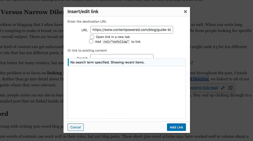
Internal links. No piece of content lives in isolation. Reference other things you've done. Lead people to more content and more topics they might be interested in. Be liberal with internal links.
We create blog content that converts - not just for ourselves, but for our clients, too.
We pick blog topics like hedge funds pick stocks. Then, we create articles that are 10x better to earn the top spot.
Content marketing has two ingredients - content and marketing. We've earned our black belts in both.
Meta title. As it shows up in Google's search results, the title of your post is of critical importance for bringing people to your site in the first place. Many SEO professionals test meta titles over time to optimize their click-through rate as well.
On the other hand, meta descriptions are often ignored, and keyword density is essentially dead with semantic indexing.
The primary "invisible" SEO technique that I would label indispensable is Schema markup. It's just too important now to ignore.
7. Write Enough
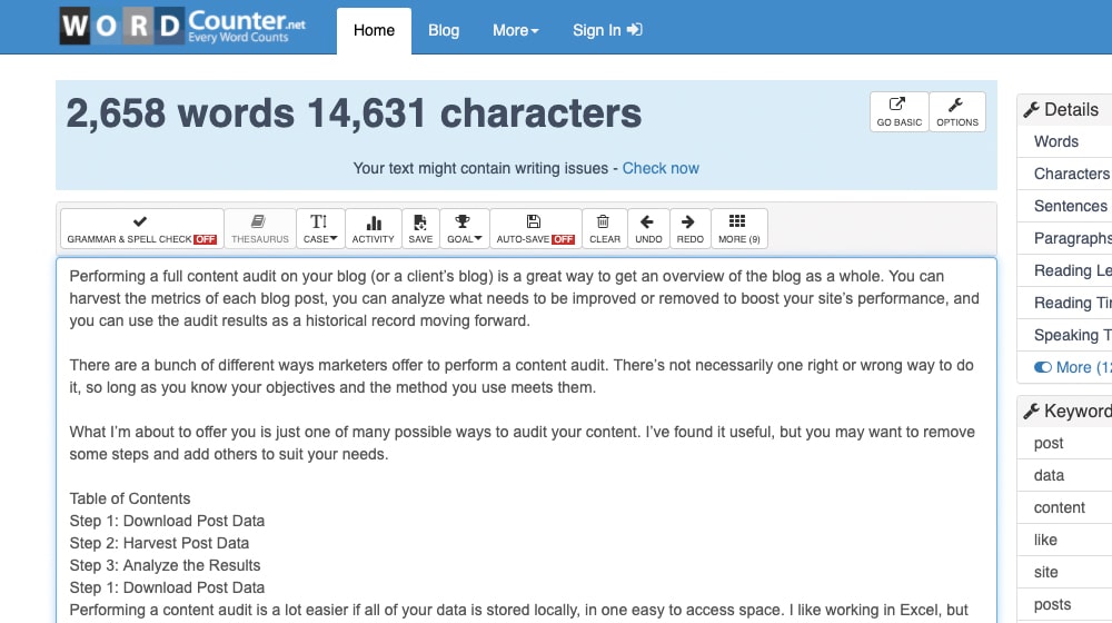
I'm a big fan of longer blog posts. Every post I write is bare minimum, 2,000 words long. Often, they end up 3,000 or more. I've even had a few hit 5,000. I love focusing on word count.
Word count always doesn't matter.
Okay, well, that's a bit of a lie. You need to write enough to thoroughly cover the topic, and also to do a better job of it than similar articles. If you're under 500 words, chances are pretty good you don't have enough value in your article, and it's unlikely that it will perform at a high level. Once you reach that minimum threshold (which, to me, is around 1,500 but can be lower for some blogs and niches), you only need to write enough to cover your topic in full.
A shorter post with less fluff and more value is better than a longer post with less weight (or similar value spread throughout more words).
8. Always Be Testing
One of the biggest keys to successful blogging is testing and changing your content on an ongoing basis.
There have been times where I've wanted to link to what I know is a popular post from a top content creator like Neil Patel or Darren Rowse, only to find that the article has disappeared.
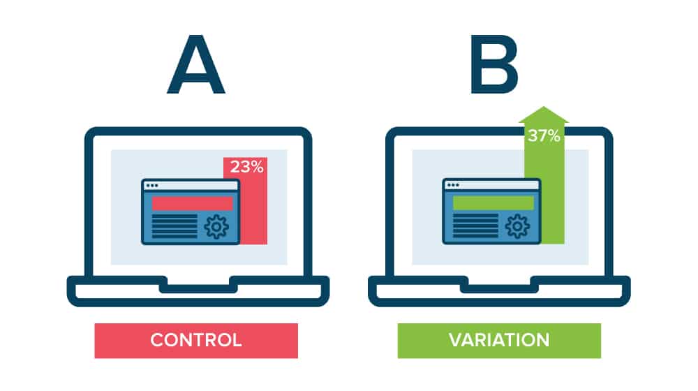
Except, the post didn't disappear. Those content creators changed their article titles, and I was looking for the titles I remembered. Their testing showed that the new title worked better for attracting their desired audience on organic search results.
Always be testing. Focus on your not-quite-top performing posts, but the ones that you could kick into overdrive with just a little tweaking. Use your top performers as ideas on how to optimize.
9. Offer Something Free
This one is part of conversion rate optimization. When a user lands on your site, which do you think will be more attractive to them: seeing three CTAs for your $5,000 consulting service or three CTAs for your free eBook?
"Free" is extremely attractive. The key is to remember that just because you offer something free doesn't mean you offer everything free.
"Free" is a gateway. Get people hooked on your service with a free trial. Get them to trust you with free top-tier content. Develop free tools to give them added value.
And, of course, remember: "free" doesn't mean free. People pay for your free content by giving you their email addresses or some other bit of helpful information.
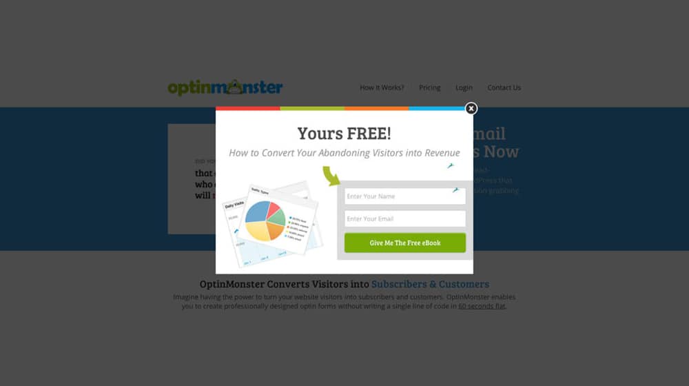
Take a three-question survey and get a coupon! Sign up for the newsletter and get a free eBook!
It's all about paying with information.
Friction in the conversion process is the absolute killer. Every single button they need to click, every single field in a form, every single page that needs to load is friction. Simplify your funnel.
10. Optimize Your CTA Format
For a while, the prevailing wisdom was that disrupting the user caused them to focus on what you put in front of them, which got more people to perform whatever action you're promoting. That led to millions of websites using shutters and timed pop-ups, a trend that continues today.
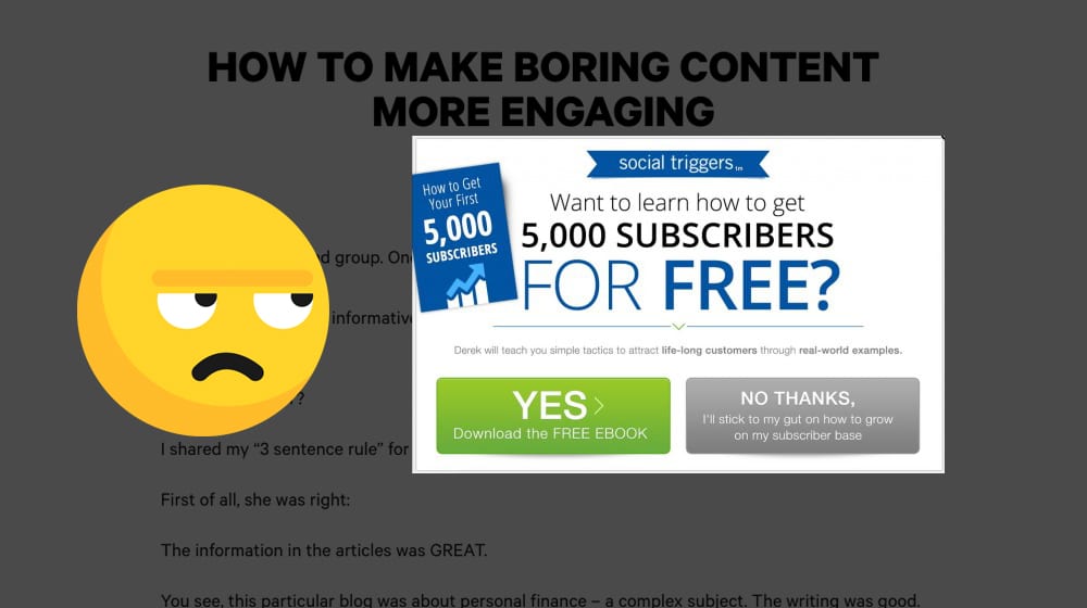
The effectiveness of these pop-ups has dropped dramatically over the last year, precisely because they're now everywhere. When I land on a site, I can tell you that I'm already poised to hit ESC to close the inevitable pop-up, and I read less than one in a thousand of them. It's just not worth my time or attention.
Optimize the channels you use for your calls to action. Hello Bars, slide-in boxes, and links in your navigation are often much more effective than full-page disruptions. Of course, this depends entirely on your audience and your offer, so again, constantly be testing.
11. Use Animations (Carefully)
Like the venerable T-rex, our vision is based on movement. Even tiny movements can draw the eye, no matter how focused you are on your current task. Use this to your advantage.
CSS is very powerful these days, and there are entire libraries of CSS animations you can drop into specific elements with zero overhead (unlike animated gifs and other media.)
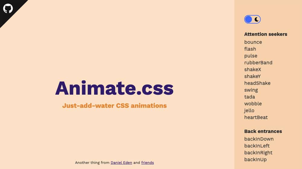
Use animations, but be very careful not to over-use animations. I think no more than 1-2 elements on a page should animate without user input. What about a button that wiggles occasionally? That's fine. How about a box that slides in after a time? That's fine. Should you use a link that wiggles when the user mouses over it? Wonderful. Just don't overload your page with wiggly bits, or we'll all think your website is having a seizure.
12. Track Goals and Use UTM Parameters
I tell you to test, but how can you know what works? Two things: UTM parameters and Google Analytics goals.
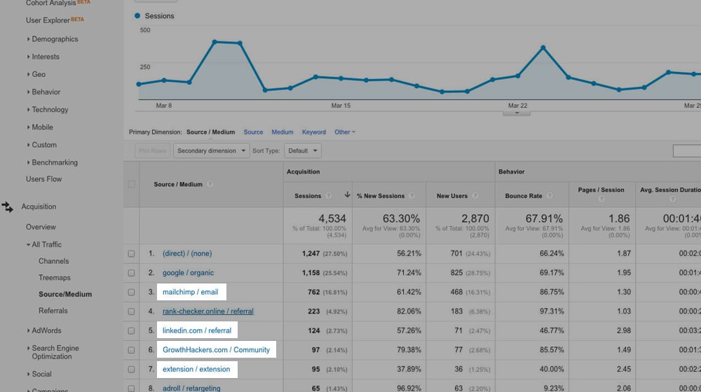
UTM parameters are potent additions to links, which you can use to track things like which link on a page gets more clicks to the same destination, which articles you promote on social media refer the most conversions, etc. Here's a rundown on using them.
Goals are critical for tracking conversions, but most importantly, tracking conversions from specific sources and sales that aren't from your standard opt-ins and purchases. Here's a guide on setting them up properly.
13. Focus on Top-Performing Topics
Are you familiar with the Pareto Principle? It's the observation that, across multiple topics and in various fields, 20% of your work results in 80% of your results. 80% of people drive on 20% of roads. 80% of your traffic comes from 20% of your posts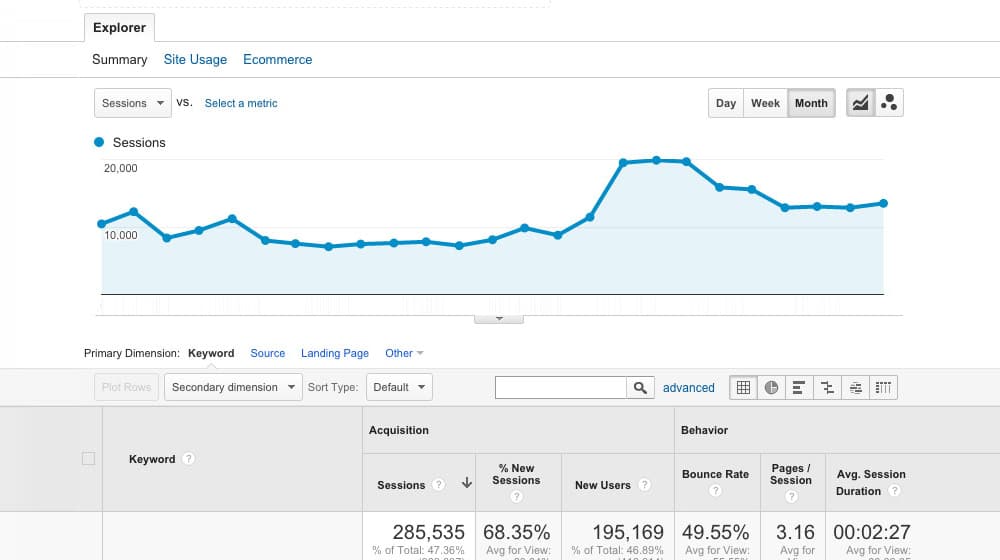
Focus on identifying and optimizing 20% of your posts. Push your top-tier content so high that your competitors can't beat it. Then, work your way backward. Back-fill value into your slightly under-performing content, then dig into your mid-range content and try to replicate what makes your top 20% excellent.
14. Minimize Promotional Copy
It would help if you had a call to action to get users to do things, but in my personal and professional experience, CTAs in your blog posts are often disruptive and tricky to nail down. That's why I always minimize how many I use, and if I use any at all, they're focused on getting you to comment on my blog, at most.
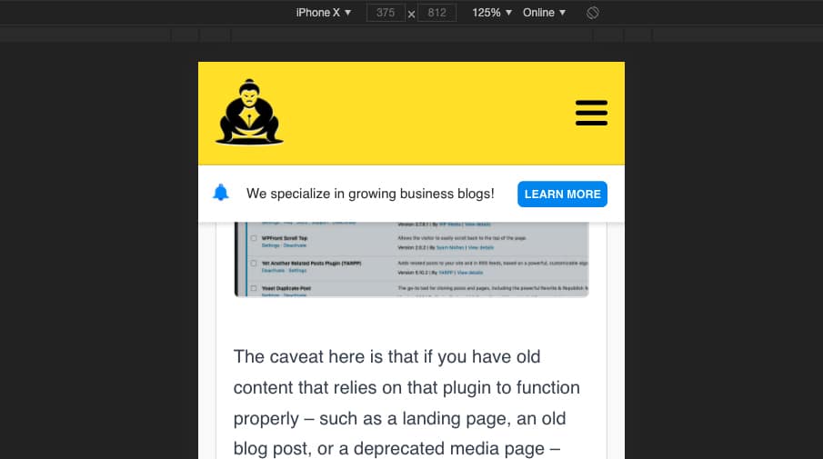
Save your CTAs for sidebars, nav bars, slide-ins, and other formats. Try to minimize the promotional content in your copy, if possible. Keep your copy valuable without distraction. You don't want to give search engines and users the wrong idea that your article is biased in any way.
15. Laser-Target Promotion
"Promote your posts" is baby-level advice. One of the worst mistakes marketers make is promoting their content in too many places at once, spreading themselves too thin. If you set up accounts on every social network out there, consider pausing half of them, or close most of them. Pick the top three worth using for your specific audience.
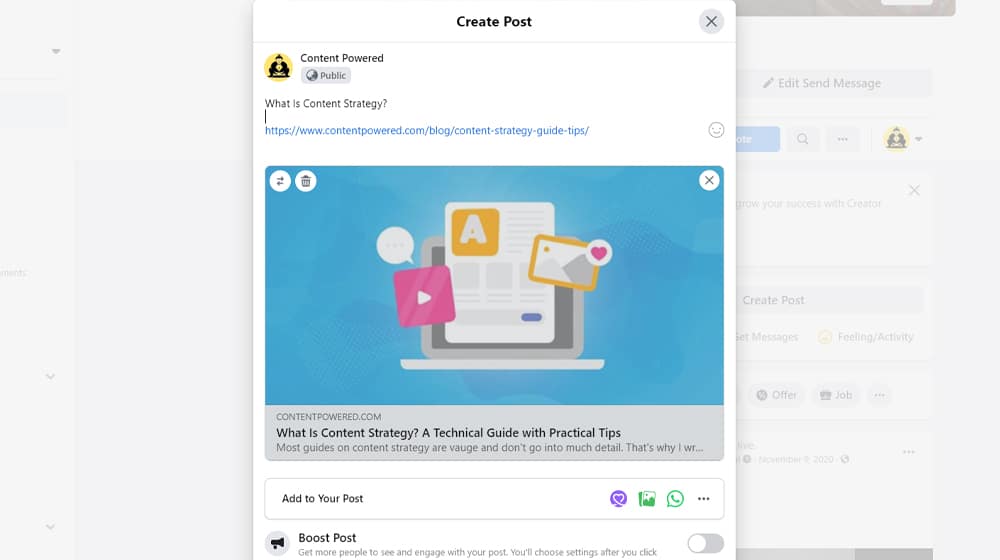
The same goes for PPC. Are you targeting every possible keyword? Cut most of them. Are you operating on more than two PPC networks? Close them. This strategy, too, is Pareto at work. 80% of your results come from 20% of your promotion, so identify the channels that bring you that promotion and use them.
If you put all of this into motion, then you'll be on a good track to create top-tier lead gen content of your own.




December 11, 2021
Do you a have a guidelines on how to properly test content?
December 20, 2021
Hey Frank!
Yes, I wrote a separate post on the subject here back in February: https://www.contentpowered.com/blog/tools-check-quality-blog/
I hope it helps you!
September 17, 2024
Whoa so when I tried to do journeys with a pop-up it really tanked my engagement rates. Do you have any recommendations?
September 23, 2024
Hey there Norris!
You know pop-ups can be pretty difficult for engagement. I sometimes find that timing matters quite a bit. Maybe you could try exit-intent pop-ups instead. They pop up when users are about to leave which could work better for you.
You might also want to try less intrusive methods like inline forms. They blend into your content more easily so they're kind of a softer approach.
Let's keep experimenting together! Do you have any specific journeys you'd like to share?
September 24, 2024
did you try countdown timers on pop-ups?
September 30, 2024
Hey Virgilio!
You know I have tried countdown timers on pop-ups and they're pretty helpful at creating urgency and improving sign-ups!
Oh and another thing - exit-intent pop-ups can be magic for grabbing attention right before someone leaves.
I'm curious what kinds of results you have seen with countdown timers? Let me know if you have any more questions! 😊