The Importance of Breadcrumbs and Their SEO Benefits

SEO is full of hundreds of little quirks of web design, both hidden and visible. All of these factors have an influence on both usability and search appeal, so it's no wonder that we marketers are always telling you that you need to optimize this or implement that or change this around to get the best benefit.
The trouble comes when we tell you to do something, but you have no idea what it means. There are so many different little elements of SEO that we take for granted, but which you may not have heard of, seen named, or even thought about before.
This article is part of an effort I'm slowly implementing to help demystify, explain, and otherwise educate my readers on these various concepts. For those of you who are experienced SEO pros, you probably don't need to read this post. If you're new to SEO and aren't quite sure what breadcrumbs are or why they're important, well, read on.
 30 Second Summary
You'll find breadcrumbs important for helping users navigate your website. They show up at the top of your page and work like a trail back to your homepage. You'll get three main types: hierarchy (for blogs), attribute (for online stores) and path (which you should avoid). When you add breadcrumbs, you'll make your site easier to use and help Google index your pages better. You can add them easily with plugins like Yoast SEO if you use WordPress, or with simple HTML if you don't.
The tale of Hansel and Gretel is a fairy tale originally coming from Germany. It was popularized by its inclusion in the tales recorded by the Brothers Grimm back in 1812. It has since become part of popular culture, saturating national and global consciousness in everything from minor references to upcoming movies.
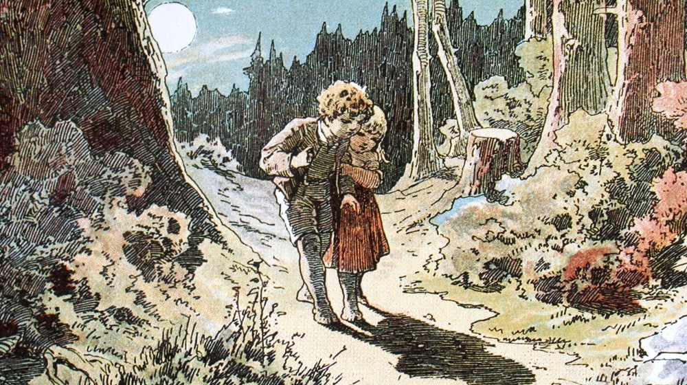
The plot of the tale is quite simple. A poor family with two children encounter a famine, and rather than starve to death, the parents decide to leave their children in the woods. (Hey, German fairy tales are pretty grim.) Hansel sneaks out and gathers up white pebbles. The next day, when their parents lead them into the woods, Hansel leaves those pebbles behind as markers for their trail. After it's clear that they've been left behind, the children follow the pebbles home and return.
Later, another famine strikes, and the same plan is hatched again. Their stepmother, wise to the pebble plan, locks their door to prevent them from gathering the rocks. Hansel takes a piece of bread, and uses the bread crumbs to mark their trail.
Well, this fails, because bread is food and birds eat the food. The children wander, come across a house made out of food, a witch invites them in and feeds them – to fatten them up so she can eat them – and keeps them around. When the day comes to eat the children, the children trick the witch into jumping into her own oven, then lock her in. The kids ransack the house, steal her valuables, and find their way home, where their stepmother – who hatched the plan to leave them in the first place – has died. The kids and their dad live happily ever after.
There's a lot more history to the tale – it's quite dark and less hopeful in a few versions – but none of that really matters. You can read more about it yourself.
The important part is that this story is where the modern-day concept of the trail of breadcrumbs comes from, and it's why these little navigation links are called breadcrumbs in the first place.
Much like the children used crumbled bits of bread to try to guide their way home, so too can your website users use your site breadcrumbs to find their way to your homepage. Just, unlike the original fairy tale, your website breadcrumbs are not eaten by birds, so they work more like the pebbles in the original tale.
Hey, no one said these historical names made sense. Calling them "website pebbles" might be more accurate, but less catchy. Popular culture remembers the crumbs as working, I suppose.
Breadcrumbs are used for navigation in the original tale, and they're used for navigation on your website.
Do you see them up there? I use them on this site. Take a moment and look up at the very top of your screen, below the yellow navigation bar but above the title of the post. You'll see a box that says something like:
Home > Blog > Webmaster > The Importance of Breadcrumbs and…
These are breadcrumbs. You can see another example on, say, the Barnes and Noble website. It's smaller and it's harder to spot amongst all of the assorted navigation links, but above the product images you see [Shop / Books]. Those are the breadcrumb links for that product.
Breadcrumbs are a navigational tool, but they have benefits for both users and for the search engines.
There are a lot of different benefits for your site when you use breadcrumbs for navigation. Let's run through them.
They help users see where they are on your site. Using my own site as an example, you can look up at any time and know that you're on a blog post in a specific category of blog posts, in the overall blog. While that doesn't sound very useful, it's good to know once I start adding in other types of content, like infographics, videos, or case studies.
This benefit is much more useful for, say, e-commerce sites. Sites like Amazon have a huge array of different categories with thousands up on thousands of sub-categories under each of them. If you're looking for a single specific kind of LED light bulb, you can visit any LED bulb page from a Google search, then click the breadcrumbs to go back to general LED categories, then further drill down, and generally use it as very potent navigation.
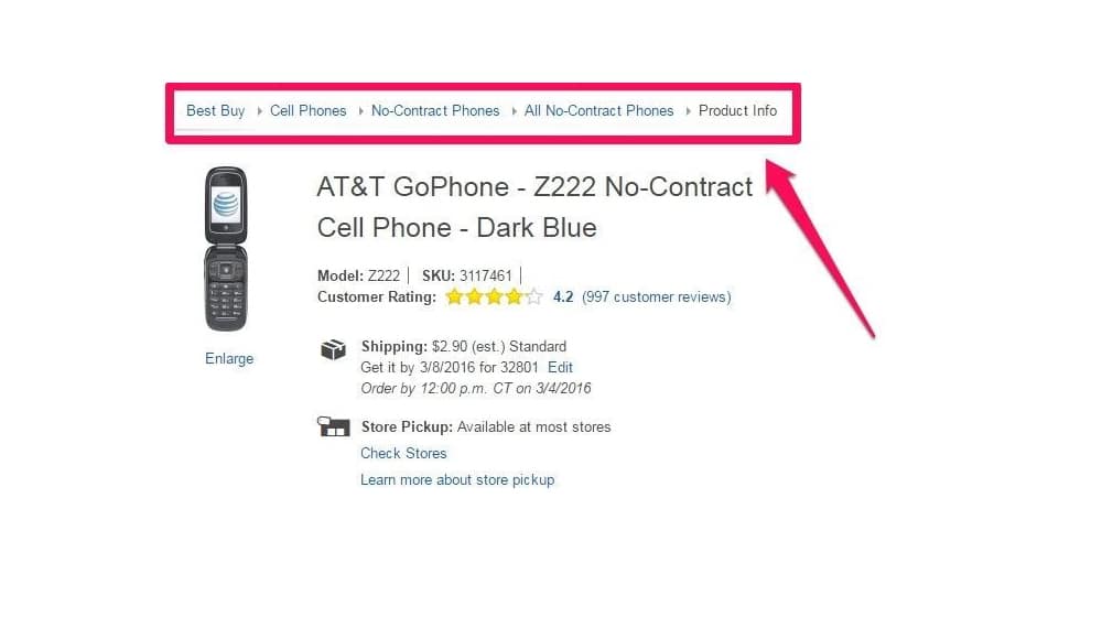
They help users navigate to other sub-sections of your site. With my site, you can click on the general blog link to go back to the blog without having to go all the way back to the homepage and find the blog header link. Of course, there's also the blog link in the top bar navigation, so that's a little less useful.
This is better for category pages. The "webmaster" link, for example, takes you to the category page for all of the blog posts on this site tagged with the webmaster category. This can be useful if you're looking to read all of the posts on the site with a given kind of topic, like those, or the posts about PPC topics, or the posts about marketing topics in general, and so on.
They provide a consistent, easy access to categories and your home page. Consistency is one of the biggest benefits. Every site has a different layout, even though there are a lot of web standards that most sites follow these days. Breadcrumbs are generally always in the same place, and they have a similar kind of structure – with some variations which I'll cover below – so they're a consistent way for users to know how to navigate your site.
They make it easier for the Google web crawlers to index your pages. It's not all benefits just for users, of course. Google loves breadcrumbs. They highly encourage users to use them, as a second-tier ranking signal. It's been a recommendation for a long time.
One of the reasons Google loves breadcrumbs is because it's a great, easy way for their search spiders to find pages on your site. If they find one blog post and you have breadcrumbs enabled, they can follow those links to the category pages and then index every blog post on those category pages.
This isn't quite as comprehensive as, say, uploading a total site map to Google's search console, but they aren't mutually exclusive. Doing both is beneficial, and better than just doing one or the other.
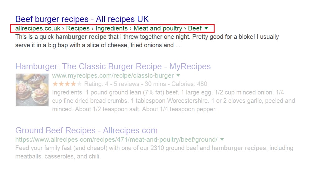
They can show up in the Google search results snippets. Google has allowed breadcrumbs to display in placed of the full URL in Google search results since 2009. Most users don't really care about the link for a post, but they might want to know if a post they're looking at has the right kind of categorization for the information they're looking for.
Admittedly, this is a subtle benefit, but it's not nothing. Taking advantage of any form of structured data Google allows you to use is a great idea.
Breadcrumbs actually come in three different categories. One is more common for tree-structured sites like blogs, one is more common in e-commerce sites, and the third is bad and shouldn't typically be used. Let's talk about them!
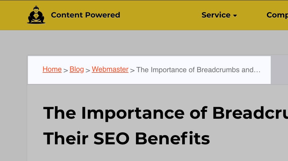
Hierarchy breadcrumbs are the kind I'm using on this site. You start at the homepage, then drill down to the broad category (like blog), then down to sub-categories (like marketing/webmaster/PPC), then any other sub-sub-categories as necessary, then end with the identifier of the location of the page you're on. I only use one category page, but I've seen blogs with up to three.
Attribute breadcrumbs are the kind you most often see on online stores. Amazon is cluttered and hides theirs most of the time, but a site like Best Buy has a good example. Up above the product information but below the blue navigation bar of this page, you can see:
Best Buy > Smart Home > Smart Speakers & Displays > Smart Speakers
The link leads to a page for a Google smart speaker. If you're shopping for that item, but want to look at other smart speakers, you can click on the speakers link. If you want to look at associated displays, you can click on the one tier up category.
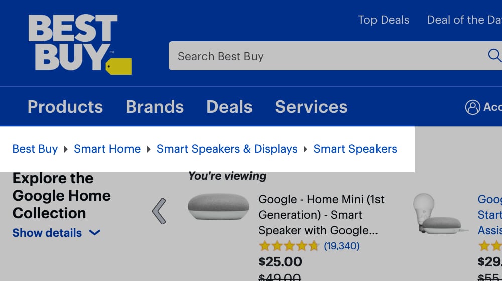
If you want to look at other smart home automation products, like thermostats or app-controlled lights, you can click on the general Smart Home category, and so on.
Path breadcrumbs are the worst because they're dynamic. They show the exact path the user took to reach a given page. For example, let's say you visited a different blog post on my site, clicked to the category page, then clicked on this one. The path breadcrumb trail might look like:
Home > Blog > Webmaster > 12 Ways to Update and Refresh an Old… > Webmaster > The Importance of Breadcrumbs and…
It has duplications because that's the path you took to reach this post. It's dynamic because it's only one of many possible paths, and it's not necessarily the path you took to get here. It's also not very useful, because your web browser has functions like the Back button, opening content in new tabs, and so on that give you all of that functionality.
I assume by now I've convinced you that you should be using breadcrumbs, so let's talk about some of the things people get wrong when implementing them. You don't want to make a mistake and make them less valuable or detrimental to your site, do you?
Not using the full path. Breadcrumbs should always start with the homepage – even if you have other links to the homepage on your site – and they should always end at the page the user is currently on. You want a complete path with as many useful links as possible along the way.
Making the path indicators too complex. Generally all you need between links is a space with a / or a > in it, though you can use symbols like the triangles Best Buy uses easily too. Getting any more complex than that makes breadcrumbs more distracting than they're worth.
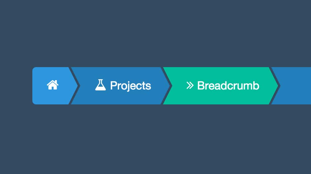
Forgetting to format the links as links. I've seen a few sites where the breadcrumbs don't look like they're clickable. They don't have underlines, their color isn't the same color as other links on the page, and so on. A huge part of the benefits of breadcrumbs come from the user being able to actually use them, so if they just look like information rather than links, you lose that benefit.
Positioning them in the wrong place. Breadcrumbs have been a standard element of web design for over a decade, so users are used to looking for them in the right place. It should be above the title and content of your page, but below other site-wide navigation. My site is a great example, as is Best Buy above.
Using breadcrumbs in the post title. I've seen the occasional site try to include breadcrumbs as part of the H1 title on the page, but it always looks clunky or software-generated, and it's rarely compelling. Google hates bad titles, too, so it won't rank well. Keep the title and the navigation separate.
Using breadcrumbs in place of navigation. Your site should have a consistent top-bar navigation structure with buttons, calls to action, logos, and whatever else you want. The exact structure and design of this navigation is personal to your site, but you don't want to try to use your breadcrumbs as a replacement for this navigation. Breadcrumbs are only for one specific type of navigation, not for full-site exploration.
Finally, there's one "don't do this" mistake that I don't think is a mistake, but some people do. They call "using a breadcrumb structure in your URL" a mistake. Personally, I feel like a bit of a breadcrumb structure is fine, but it falls apart if you have more than two categories. If you look at my URL for this post, for example, you'll see /blog/post-title, with no mention of the category. The category is useful for navigation, but it doesn't need to be part of the permalink for the full post. This one is more up to your preference, though.
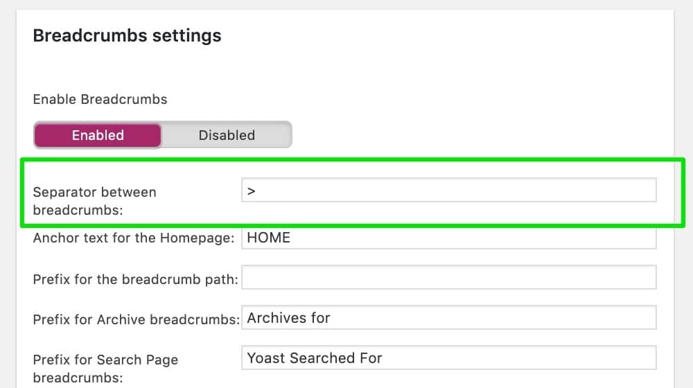
Breadcrumbs are actually trivially easy to use. WordPress already allows you to structure your posts into categories, and plugins like Yoast SEO use that category information to generate breadcrumbs. Formatting them is a simple matter of applying a little bit of CSS if you want them to be different from the rest of your site. If you don't – and they're fine as they are, usually – you can just let Yoast do its thing.
If you're not using WordPress for your site architecture, you can look at plugins or built-in features for whatever platform you're using. It's built in to Joomla, for example.
If all else fails, they're actually very easy to code, at least for basic breadcrumbs. It's some of the easiest HTML/CSS you'll ever write. Adding structured data markup is slightly harder, but it's still a very easy process.
And, of course, if you're working with a web designer, just tell them you want to make sure you have breadcrumbs for your site. They'll be able to do the rest.


 30 Second Summary


September 10, 2020
Oh man, I didn't know what breadcrumbs were until now!! Too funny. My WordPress theme already has them, now I know what to call them.
September 12, 2020
Haha! Glad I could be of some help. Breadcrumbs, cookies... somebody had an appetite when they were naming all of this internet lingo.
September 14, 2020
I never knew the original story of Hansel & Gretel and the "pebbles"!
September 15, 2020
Me neither, until I started going down the rabbit hole!