Get Nested Replies on Your Shopify Blog Post Comments
Why oh why doesn't Shopify have nested comments? It seems so simple. But no, if someone comments and then you respond to them, your reply is listed first, followed by their original question. It's quite literally backwards. But hey, the blog section has always been an afterthought to Shopify, so this is yet another thing that we have to regularly fix for our clients out of a long laundry list of things.
Here's a handy bit of JavaScript you can add to your theme to fix this:
// Shuffle around comments to give the appearance of nested comments

document.addEventListener("DOMContentLoaded", function() {
      const comments = document.querySelectorAll(".blog__comment");
      for (let i = 0; i < comments.length - 1; i += 2) {
          const firstComment = comments[i];
          const secondComment = comments[i + 1];
          firstComment.parentNode.insertBefore(secondComment, firstComment);
      }
});
Wrap this in some <script></script> tags and plop it into your footer.liquid file next to your other JavaScript. All done!
The way this works is by manually shuffling the comment order so that the original comment is listed before the reply. Then it will work like every other comment system.
An important note is that, for this to work, you have to respond to every comment that you approve. The script needs an even number of total comments and a reply to every comment in order for it to work. Which shouldn't be too big of a deal - why approve a comment if you're not going to reply to it anyway?
Here's a visual representation of how the comment order looks by default:
- Your reply #2
- Visitor's comment #2
- Your reply #1
- Vistitor's comment #1
Here's what this code does to this order:
- Visitor's comment #2
- Your reply #2
- Vistitor's comment #1
- Your reply #1
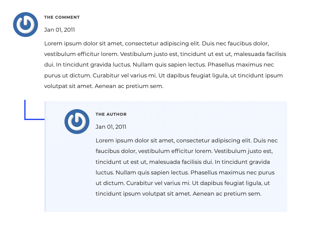
This looks even better if you add some CSS styling to indent your replies a bit, like this:
.blog__comment:nth-child(2n+1) {
    border-left: 4px solid #dee7ff;
    padding: 26px 26px 26px 60px;
    background: #f2f7ff;
    margin-left: 100px !important;
    margin-bottom: 45px;
}
This makes it so every other comment - your replies - are indented to the left by 100 pixels, and with some custom styling to differentiate the author's (that's you!) reply to the visitor.
Here's a real-world example of what this looks like:

Much, much easier to read now, isn't it?


Comments